Old type in new fonts? First impressions of Fontstore

A few days ago, Font­store launched – a new player in the market for subscription-based font services. To be accurate, Font­store is both a foundry and a font service provider: You can buy fonts there like at any other foundry, but you can also become a subscriber. For $ 15 per month (or $ 150 per year), you get access to their entire library of desktop fonts. Having used Typekit for a few years and having reviewed the Monotype Library Subscription (MLS) last year, I was curious to see what Font­store has to offer. The very first impression was not too favourable: Their website is slow and cluttered up with animations and effects, making it difficult to get an overview of their collection (others loved their site or also hated it). Font­store does not excel at transparency either: The name of its founder, Satya Rajpurohit, is nowhere to be found on the website (though he has promised to remedy this). In order to access the Font­store Library (the contents of which will be discussed below) through the subscription service, I subscribed and payed by credit card; both went without problems. Installing the app syncing the fonts on Windows was not exactly a seamless experience, though: I got a number of warnings that are typically not shown upon installing software, but just going ahead did not crash the system. Once installed, you go to the website, select the fonts you want to use, and they are available just seconds later.

Slim pickings for type designers

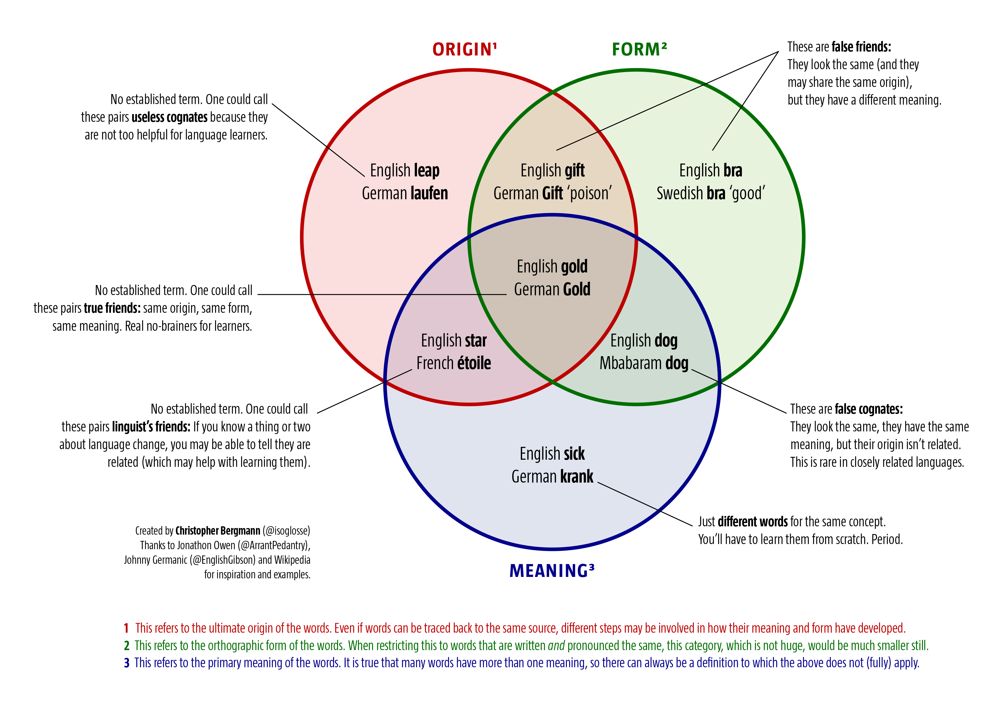
As I noted in my review of the MLS, low-priced font subscription services do not only raise technical questions, but ethical ones as well. Creating fonts is a time-consuming task requiring specialised skills that are gained through extensive training and practice. Few type designers create fonts just for the fun of it. Most do so to make (part of) a living – but you need a lot of subscribers before you are able to provide decent payment to all type designers. As a customer, you have to decide: Is subscribing to such a service tantamount to supporting exploitative working conditions and fuelling the downward price spiral in the font market? In the case of Font­store, the decision may be a little easier: All typefaces were commissioned for that service with (I presume) designers knowing what they signed for. In a post on TypeDrawers, Satya Rajpurohit, the founder of Font­store, explained that Font­store offers different payment models to type designers, neither of them based on royalties. In any case, the business risk mainly rests with Font­store, rather than with individual designers. That seems friendlier than royalty-based models, but $ 15 per month is still not much to go round, so time will tell if the system is sustainable. Also, even the best offer in a given situation can be a bad one: Font­store carries fonts from quite a few young type designers, some of them releasing their first retail fonts. Many senior designers may have been reluctant to accept Font­store’s payment models and have their fonts offered at a bargain price.

Weiterlesen

On cognates and friends, true and false

Learning a language is hard, so every little bit helps: If English is your mother tongue and you start learning German, you will be delighted to hear that the German word for hand is Hand. You may be less delighted to hear that the English word gift does not translate to its German orthographic counterpart Gift (which means ‘poison’), but to Geschenk. Then again, if you like linguistics, you will be delighted to hear that not just the former, but also the latter pair of words is etymologically related (both gift in English and Gift in German refer to something that is given to someone, the verb give also being related to the nouns). So, we have three aspects of relatedness in words: the origin (where words come from); the form (how they are written); the meaning (how we define them). For some clusters of relatedness, there are established terms: The term I have always used for words that share the same spelling, but not the same meaning is ‘false friends’ (e.g., gift/Gift). Today I learned through a blog post by Jonathon Owen that some English speakers (erroneously) refer to such false friends as ‘false cognates’ – a term that would properly be applied to words that share the same meaning and the same form across languages, but that are in fact etymologically unrelated. Inspired by said blog post, I made an overview of different types of relations between word pairs across languages, based on origin, form, meaning or some combination thereof. You can download a PDF version of the chart by clicking on the image below:

An overview of words that share the same origin, form, meaning or some combination thereof

Die englische ›type foundry‹ und ihre deutschen Äquivalente

Abstract

How do you translate type foundry into German? Gießerei (literally castery), the traditional term from the era of metal typesetting, is not used for digital foundries and seems unlikely to be revived. This text is supposed to ignite a debate about possible alternative terms. These include Schriftanbieter (literally type offerer), Schriftenhaus (type house), Schriftherausgeber (type editor), Schrifthersteller (type producer), Schriftlabel (type label), Schriftverlag (type publisher) and the English loan word Foundry.

Einleitung

Wie übersetzt man type foundry ins Deutsche? Bei einer Diskussion auf Twitter, die sich um die Suche nach einem Begriff für die deutsche Wikipedia drehte, wurde klar, dass es hierzu keinen Konsens gibt. Grund genug, sich das englische Original und einige mögliche Übersetzungen genauer anzusehen.

Den englischen Begriff definiert Wiktionary als »a company that designs and/or distributes typefaces« (»ein Unternehmen, das Schriftarten gestaltet und/oder verbreitet«). Erster Bestandteil ist type – ein Wort mit griechischen Wurzeln (altgr. τύπος ›Schlag, Stoß; Abdruck; Gepräge, Relief; Abbild, Vorbild, Vorlage; Form, Gestalt‹ zu τύπτειν ›schlagen, stoßen‹), das, übers Lateinische und Französische, Ende des 15. Jahrhunderts ins Englische kam. Ausgehend von älteren Bedeutungen wie ›(Vor-)Bild, Vorlage; charakteristische Form‹ wird es seit dem frühen 18. Jahrhundert für Drucklettern verwendet. In dieser Bedeutung wird es im Deutschen mühelos mit ›Schrift‹ wiedergegeben, so auch in einigen Wörtern, die im Weiteren besprochen werden. Der zweite Teil der Begriffs ist es, der bei der Übertragung ins Deutsche Schwierigkeiten bereitet. Drucklettern entstanden bzw. entstehen in einer foundry. Auch dieses Wort, das im Englischen seit dem 16. Jahrhundert belegt ist, stammt aus dem Französischen: Das Verb fondre, das wiederum auf das lateinische fundere zurückgeht, bedeutet unter anderem ›schmelzen‹. Eine fonderie ist eine Werkstatt, in der Metall geschmolzen und in neue Formen gebracht wird, zum Beispiel Buchstabenformen (deren Kombination zum Zeichensatz einer Schriftart als font bezeichnet wird). Im Deutschen bezeichnet man solche Werkstätten seit dem frühen 17. Jahrhundert als Gießerei bzw., wenn sie sich mit der Herstellung von Buchstaben beschäftigen, als Schriftgießerei.

Der deutsche Begriff Gießerei ist, anders als sein englisches Gegenstück, in der Zeit verblieben, in der Buchstaben aus Metall waren. Für Unternehmen, die sich mit digitaler Schrift beschäftigen, hat er sich nicht eingebürgert. Aber was soll man dann verwenden? Dass sich die Frage überhaupt stellt, dürfte auch daran liegen, dass ein Großteil des Geschäfts in dieser Branche auf Englisch abgewickelt wird. Auch auf Deutsch wird über Schrift geschrieben, aber häufiger noch auf Englisch. Die Zahl der type foundries, die eine deutschsprachige Website unterhalten, ist niedrig. In der Diskussion und bei der Recherche tauchten dann doch sechs Wörter auf, die die nähere Betrachtung lohnen: Schriftanbieter; Schrifthaus; Schriftherausgeber; Schrifthersteller; Schriftlabel; Schriftverlag (bei allen kann der erste Teil auch ›Schriften-‹ lauten, aber die Verteilung der Formen ist nicht bei allen Begriffen dieselbe).

Weiterlesen

Auf ein Wort (24): Céline Dion

Céline Dion frz. (QC) [seˌlɪn ˈd͡zjɒ̃]; frz. (FR) [seˌlin ˈdjɔ̃]; engl. (AE) [səˌlɪn diˈɑn]

Erläuterungen

Angesichts der Bekanntheit von Céline Dion war ich überrascht, wenig Diskussionen über die Aussprache ihres Namens zu finden. Als ›ursprüngliche‹ Lautung kann man wohl die betrachten, die der quebecischen Aussprache des Französischen folgt. Mit dieser Varietät ist die Sängerin aufgewachsen. Im Vergleich zur Aussprache in Frankreich, die hier als Zweites angegeben ist, fallen einige Unterschiede auf.

Zum einen ist der Vokal in der zweiten Silbe des Vornamens in der kanadischen Aussprache zentralisiert. Zu den geschlossenen Vokalen [i], [y] und [u] in Frankreich kommen in Québec [ɪ], [ʏ] und [ʊ] hinzu, die erstere in vielen geschlossenen Silben ersetzen und sowohl lang als auch, wie hier, kurz sein können. In ihrer englischen Aussprache des eigenen Namens übernimmt Céline Dion diesen zentralisierten Vokal. Es sei darauf hingewiesen, dass die Lautung mit [iː] – also [səˈliːn] oder auch [seˈliːn] mit Vollvokal in der ersten Silbe – im Englischen von anderen Sprechern am häufigsten zu hören ist.

Ein weiterer Unterschied zwischen den zwei französischen Varietäten findet sich im Nachnamen: Im quebecischen Französisch werden [t] und [d] vor Vordervokalen affriziert, also [t͜s] bzw. [d͜z] gesprochen. Außerdem ist der Nasalvokal am Ende im Vergleich mit der Aussprache in Frankreich offener. In Québec werden die Laute, die in Frankreich nasale Monophthonge sind, zudem von einigen Sprechern diphthongiert – im Fall von [ɔ̃] zu [ɒ̃ʊ̯̃]. Die Aussprache des Nachnamens in einer Silbe wird im Englischen zu zwei Silben aufgebrochen, wobei in der zweiten, betonten Silbe meist ein Vokal aus dem ›lexical set‹ von lot verwendet wird, also [ɒ] im britischen und [ɑ(ː)] im amerikanischen Englisch.

Eindeutschung

Für deutsche Sprecher ist der Name keine allzu große Herausforderung. Als Eindeutschung zu empfehlen wäre [seˌliːn ˈdi̯õː] (ungefähr: ßee-LIHN DIÕ). Der Vorname reimt auf ›Berlin‹. Der Nachname kann auch zweisilbig – also [diˈjɔ̃] – ausgesprochen werden. Wer kann, sollte der im Deutschen verbreiteten Tendenz widerstehen, den Nasalvokal denasaliert und gefolgt von [ŋ] auszusprechen.

Quellen

Vacuüm in het woordenboek

Onderzoek in de media: discussie in een vacuüm

Gister stond het in de krant: ‘Lager loon voor platprater’. Het artikel in het AD ging over onderzoek dat Jan van Ours, hoogleraar arbeidseconomie aan de Universiteit van Tilburg, samen met Yuxin Yao heeft uitgevoerd. Op 16 september is het onderzoek gepresenteerd op het EALE-congres in Gent. Naar aanleiding van het krantenartikel was er enige discussie over het onderzoek in de (sociale) media.* Die discussie was in de eerste plaats gekenmerkt door een opmerkelijk gebrek, namelijk een gebrek aan details. Het artikel in het AD maakte geen gewag van zo’n beetje alles wat je over een dergelijke analyse wilt weten. En in eerste instantie bleek er ook geen onderzoeksrapport, manuscript of artikel beschikbaar met de nodige informatie. Pas later op de dag vond ik een rapport van een paar maanden geleden, maar we weten niet of dat de huidige stand van de analyses weergeeft. Desondanks schroomde menigeen niet om zijn zegje te doen over het onderzoek, gebaseerd op een krantenartikel.

Dat kan volgens mij beter. Hier lees je wat ik journalisten en wetenschappers zou willen aanbevelen in het belang van een serieuze discussie over de resultaten van wetenschappelijk onderzoek:

Vacuüm in het woordenboek
Weiterlesen

Identical zero and oh glyphs

Zero vs. oh: Strategies of glyph differentiation

When characters look similar to one another, misreadings or even misunderstandings may result. In such cases, type designers often try to avoid glyphs looking completely identical. One example of a similarity that can get too close for comfort is between the digit ‘0’ (henceforth: zero) and the letter ‘O’ (oh). Differentiation strategies between lining zero and upper-case oh have been shown to be fairly uniform across typefaces: Zero is almost always narrower and often less tall than Oh. These and other strategies have been discussed in a 2013 article by Charles Bigelow. He focuses on lining figures in typewriter typefaces and only briefly mentions contemporary approaches to non-lining zero and lower-case oh – a pair that is also prone to confusion and seems to be treated with less uniformity in recent typefaces. Inspired by a tweet by Shiva Nallaperumal, I have compiled typical and not so typical ways of distinguishing non-lining zero from lower-case oh. My observations are mainly based on old-style roman text typefaces in the Typekit library; this sample is not representative of anything but the Typekit library itself, which, however, contains a bunch of well-known, widely used typefaces.

Weiterlesen

Charis SIL, used in the Longman Pronunciation Dictionary

Fonts for phonetic transcriptions: An overview

In 2014, I started compiling a list of fonts for typesetting phonetic transcriptions using symbols of the International Phonetic Alphabet (IPA). It is probably the most comprehensive and up-to-date list of such fonts, providing short, yet detailed reviews of the typefaces and the quality of their symbols – but it has two disadvantages: First, the reviews are written in German, which most people do not read. Second, the list – featuring more than 40 typefaces – has grown quite long and maybe even a bit confusing. If you are looking for a decent sans-serif typeface that includes phonetic symbols in its bold style, the long list will not be much help. That is why created a table of all fonts for phonetic transcriptions I am aware of (thanks to Friedrich Althausen, the designer of the Vollkorn typeface, for the suggestion!).
Charis SIL, used in the Longman Pronunciation Dictionary by John C. Wells
For each font family, I have indicated whether the roman and italic styles in the regular and bold weights contain phonetic symbols (R: Regular Roman; I: Regular Italic; B: Bold Roman; BI: Bold Italic).¹ Whenever a typeface family includes more than these four styles, this is noted in the ‘More styles’ column (but you’ll have to look up the details for yourself). This is also true when a typeface has more than one bold weight (e.g., Semibold and Bold) or more than one italic style (e.g., ‘true’ italics and oblique). If you want to read the typeface reviews, click on their names (warning: German content ahead).

In each category,  means that a (more or less) complete set of phonetic symbols is available. Even if a font is marked that way, some symbols may be missing. (✓) means that a style or weight is present in the typeface, but that it does not contain phonetic symbols.  means that a style or weight is missing entirely from the typeface in question.² The last column contains a rating: This is not about whether a typeface is nice in general, but only refers to the completeness, drawing quality and functioning of the phonetic symbols. Please note that a five-star rating, used for the best typefaces in this area, does not imply that the typeface is absolutely complete and utterly flawless; minor deficiencies may remain. In any case, the rating is subjective, of course, so feel free to comment if your evaluation differs from mine. Also, please let me know if you know of any other typefaces with phonetic symbols.

Weiterlesen

Valse klemtoonvrienden:
Wortbetonung im Deutschen und Niederländischen

Als ›falsche Freunde‹ bezeichnet man Paare von Begriffen, die in zwei Sprachen eine ähnliche Form, aber eine unterschiedliche Bedeutung haben. Am häufigsten kommen solche Paare in Sprachen mit gemeinsamem Ursprung vor. Listen deutsch-englischer falscher Freunde füllen Bücher, während die Kombination Kurdisch/Guaraní an solchen Stolperfallen eher arm sein dürfte. Meist geht es nämlich um Kognaten, also Wörter identischer Herkunft, die sich über die Jahrhunderte semantisch weiter als lautlich voneinander entfernt haben. Falsche Freunde sind diese Begriffe deshalb, weil sie beim Zweitspracherwerb für Schwierigkeiten sorgen: Wer eine Sprache lernt, die der eigenen Erstsprache bzw. einer bereits erlernten Zweitsprache ähnlich ist, nutzt das Vorwissen und versucht anfangs, sich die neue Sprache durch den Transfer von Elementen der bekannten Sprache zu erschließen. Oft trennt die Erst- und die Zweitsprache ja bloß eine unbedeutende Lautverschiebung bei tatsächlich identischer Bedeutung.

Transfer findet aber auch statt, wenn es nicht um Semantik geht. Im morphologischen Bereich ist zum Beispiel bekannt, dass deutsche Muttersprachler das grammatikalische Geschlecht (Genus) niederländischer Wörter mit hoher Trefferquote nennen können – schlicht auf der Basis ihrer Kenntnis des Deutschen. Falsche Freunde in diesem Bereich wären Wörter wie ›Orgel‹ (gleichbedeutend in beiden Sprachen), das im Deutschen ein Femininum ist, im Niederländisch dagegen ein Neutrum. Ein Bereich, in dem seltener über Transfer gesprochen wird, ist die Wortbetonung. Allerdings dürfte auch hier der Spracherwerb zumindest anfangs auf Transfer basieren. Man geht – nicht ganz zu Unrecht – davon aus, dass die Betonung ähnlicher Wörter in ähnlichen Sprachen auf derselben Silbe liegt.

Im Folgenden stelle ich eine Liste von mehr als 60 Wortpaaren vor, die im Deutschen und Niederländischen (fast) gleich geschrieben, aber (meist) unterschiedlich betont werden. Eine Frage, die ich hier nicht beantworten werde, ist die nach dem Warum – allerdings nicht, weil sie uninteressant wäre. Der Grund ist, dass die Liste mehrheitlich relativ rezente Fremd- und Lehnwörter enthält. Bei solchen Wörtern wird die Wortbetonung – anders als bei nativen Wörtern oder älteren Lehnwörtern – nicht ausschließlich von fonologischen Prinzipien bestimmt. Oft spielen auch die Herkunfts- oder Vermittlersprache bzw. sprachinterne Ähnlichkeiten eine Rolle. Diese Faktoren für die untenstehenden Wörter zu entwirren, geht über das hinaus, was ich hier leisten kann. Sollte sich jemand die Mühe dieser Arbeit machen, bitte ich um Nachricht. Selbiges gilt bei Fehlern und Unvollständigkeiten, insbesondere in Bezug auf Lautungen, die außerhalb von Deutschland oder den Niederlanden gebräuchlich sind.

Weiterlesen

Phonetic repair service: Fixing ATypI’s IPA

The 2015 edition of the annual conference of the Association Typographique Internationale (ATypI) took place in São Paulo, Brazil. Its visual identity was based on the phonetic transcription of the local pronunciation of the name of the host city: /ˌsɐ̃w ˈpawlu/. From this transcription, one symbol was isolated and used as a sort of logo: /ɐ̃/ – both an interesting glyph design-wise and the symbol of a characteristic sound of Portuguese (a nasalised centralised vowel). I think it was a great choice for a type conference in Brazil. What’s more, I liked the typefaces they used in their visual identity, among others Voces (by Ana Paula Megda & Pablo Ugerman) and Brasilica (by Rafael Dietzsch). An extension of the latter, including phonetic symbols, has been announced for 2016 (and I’m quite curious about that).

Logo of the 2015 ATypI conference, using a phonetic symbol

Despite the cleverness of the concept, not all of its implementations were equally successful. I saw one on YouTube that I was a bit disappointed about: The video recordings of all conference talks – kudos for making them available – had thumbnails showing the names of the speakers and phonetic transcriptions of their names. As I already pointed out on Twitter, many of the transcriptions were inaccurate. In some cases, it was not even clear to me if the transcription was supposed to represent an Anglicised pronunciation or the way speakers would pronounce their names in their native languages. Admittedly, making phonetic transcriptions is not that easy – whether you use the International Phonetic Alphabet (IPA), as they wisely did, or any other system. I don’t know who created the transcriptions in the thumbnails and I don’t know why they ended up being inaccurate: Maybe the transcriber was lacking information or it was a rush job or correct transcriptions were garbled in the design process.

What I want to do here is to provide correct transcriptions of the native pronunciation of the speakers’ names (or at least, I will try to avoid the most egregious mistakes that were made in the original transcriptions). As I said before, making phonetic transcriptions can be difficult: Language varies a lot – across place, time, situation etc. Not everyone agrees on how to describe all this variation; not everyone agrees on how to transcribe it. Trying to pin down the symbol that exactly represents one sound has led to heated debates among linguists more than just once. For that reason, I’d like to invite you to let me know if you disagree with the way I transcribed any of the names.

For all those who do not read IPA transcriptions fluently, there are some audio recordings: Whenever you see a ? symbol next to a name, you can click on it to listen to the speaker’s own pronunciation of their name. Most speakers say something along the lines of ‘Hi, my name is […], I come from […] and my mother tongue is […]’ – all that in (one of) their native language(s). I hope to add more recordings in the future, but this may take some time. Similarly, some transcriptions require a bit of research, so the list will not be complete from the outset, but be filled over time. Anyway, here is the list:

Weiterlesen

Celebrating Dialect Month: 31 songs in small Germanic varieties

In 1986, SONT – a dialect organisation from the Netherlands – declared March to be ‘Dialect Month’. In 2016, March as Dialect Month is surprisingly still celebrated in the Netherlands. Perhaps not so surprisingly, the idea did not catch on anywhere else (not even in Belgium). That is too bad.

My 2016 contribution to promoting March as Dialect Month outside the Netherlands – and slightly widening its focus – was this: On each day of March, I posted and tweeted about a song that is sung in a small Germanic variety. In my definition, this is any variety that belongs to the Germanic branch of the Indo-European language family, except for standardised varieties of the most widely spoken national languages (e.g. English, German, Dutch, Swedish etc.). You know what these standard varieties sound like (and if you don’t, that is easily remedied). My list of songs features varieties that are not used by as many speakers and therefore not heard as frequently. Some of the varieties in my list may even be at risk of becoming extinct in a not-too-distant future. Let’s listen to them while they are still being used.

Below is a highly subjective, completely unrepresentative list of 31 songs in small Germanic varieties. On Twitter, I used #SiSGV (Songs in Small Germanic Varieties) as a hashtag. All songs can be found in this Spotify playlist (I am sorry if you can’t listen to all songs in your country) and, whenever possible, I tried to supply links to other legal sources as well as the lyrics of each song. If you have any questions, suggestions or corrections, feel free to comment. Here is the list:

Weiterlesen