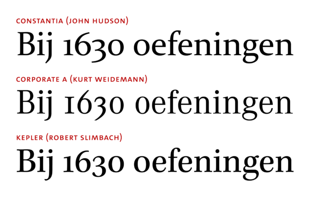
When characters look similar to one another, misreadings or even misunderstandings may result. In such cases, type designers often try to avoid glyphs looking completely identical. One example of a similarity that can get too close for comfort is between the digit ‘0’ (henceforth: zero) and the letter ‘O’ (oh). Differentiation strategies between lining zero and upper-case oh have been shown to be fairly uniform across typefaces: Zero is almost always narrower and often less tall than Oh. These and other strategies have been discussed in a 2013 article by Charles Bigelow. He focuses on lining figures in typewriter typefaces and only briefly mentions contemporary approaches to non-lining zero and lower-case oh – a pair that is also prone to confusion and seems to be treated with less uniformity in recent typefaces. Inspired by a tweet by Shiva Nallaperumal, I have compiled typical and not so typical ways of distinguishing non-lining zero from lower-case oh. My observations are mainly based on old-style roman text typefaces in the Typekit library; this sample is not representative of anything but the Typekit library itself, which, however, contains a bunch of well-known, widely used typefaces.
Zero vs. oh: Strategies of glyph differentiation
4 Antworten