Typeset letters of the Latin alphabet are typically unconnected – such as the ones you are reading right now. There are typefaces in which letter shapes (glyphs) appear mostly connected (e.g., styles mimicking handwriting or calligraphy). In this piece, though, I will focus on typefaces in which most glyphs are not connected to their neighbours, but separated from them by a certain amount of white space.
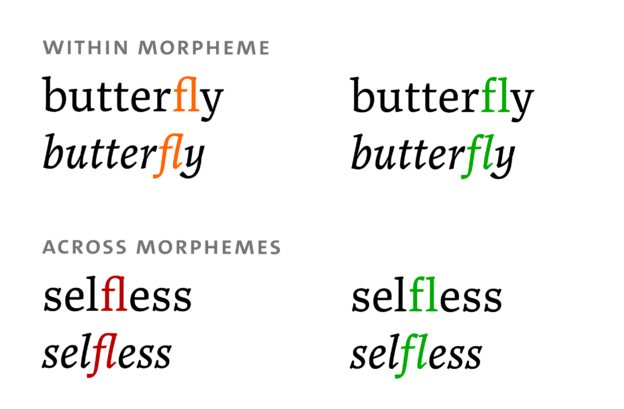
Even in such typefaces, there are cases in which letters are represented by a connected shape. This is referred to as a ligature. There are two common reasons for using ligatures: First, the juxtaposition of letters in a word can lead to an overlap of shapes that is considered aesthetically displeasing by the designer. Adding more white space between the shapes does not always resolve the problem in a way that is seen as satisfactory. Sometimes it is perceived as a better solution to merge the overlapping shapes into one shape that represents several letters. Second, ligatures can also be used for decorative purposes, when shared shapes are created for letters that normally would not overlap.
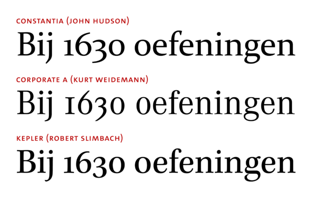
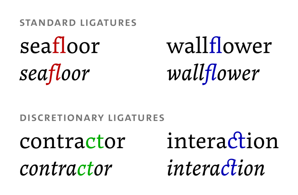
In digital typesetting, a ligature that deals with an unwanted overlap is referred to as a ‘standard’ ligature (OpenType feature liga) – shown in the top part of the picture below. The overlapping glyphs are highlighted in red; the ligature glyph in which the accidental overlap is replaced by a smooth connection is highlighted in blue. A decorative ligature is a ‘discretionary’ ligature (OpenType feature dlig) – shown in the bottom part of the picture. The glyphs highlighted in green do not overlap; when a connecting element is added, this leads to the blue ligature glyphs. Discretionary ligatures are often used sparingly and, as the name indicates, at the typesetter’s discretion. Their use will not be discussed here. (The serif typeface used for all the samples in this article is Noort by Juan Bruce.)
In this piece, I would like to argue the following:
- It is preferable to avoid standard ligatures (i.e., ligatures used for dealing with glyph overlaps) and to handle overlaps in a way that keeps letter shapes unconnected.
- If standard ligatures are used, their use must be in line with language-specific structural rules. Unconnected alternatives must be provided for all ligature pairs.