Schlagwort-Archive: Gestaltung

Ligatures and contextual alternates

The self‌less butterfly. Or: Using and avoiding ligatures.

Typeset letters of the Latin alphabet are typically unconnected – such as the ones you are reading right now. There are typefaces in which letter shapes (glyphs) appear mostly connected (e.g., styles mimicking handwriting or calligraphy). In this piece, though, I will focus on typefaces in which most glyphs are not connected to their neighbours, but separated from them by a certain amount of white space.

Even in such typefaces, there are cases in which letters are represented by a connected shape. This is referred to as a ligature. There are two common reasons for using ligatures: First, the juxtaposition of letters in a word can lead to an overlap of shapes that is considered aesthetically displeasing by the designer. Adding more white space between the shapes does not always resolve the problem in a way that is seen as satisfactory. Sometimes it is perceived as a better solution to merge the overlapping shapes into one shape that represents several letters. Second, ligatures can also be used for decorative purposes, when shared shapes are created for letters that normally would not overlap.

In digital typesetting, a ligature that deals with an unwanted overlap is referred to as a ‘standard’ ligature (OpenType feature liga) – shown in the top part of the picture below. The overlapping glyphs are highlighted in red; the ligature glyph in which the accidental overlap is replaced by a smooth connection is highlighted in blue. A decorative ligature is a ‘discretionary’ ligature (OpenType feature dlig) – shown in the bottom part of the picture. The glyphs highlighted in green do not overlap; when a connecting element is added, this leads to the blue ligature glyphs. Discretionary ligatures are often used sparingly and, as the name indicates, at the typesetter’s discretion. Their use will not be discussed here. (The serif typeface used for all the samples in this article is Noort by Juan Bruce.)

Standard ligatures and discretionary ligatures

In this piece, I would like to argue the following:

  • It is preferable to avoid standard ligatures (i.e., ligatures used for dealing with glyph overlaps) and to handle overlaps in a way that keeps letter shapes unconnected.
  • If standard ligatures are used, their use must be in line with language-specific structural rules. Unconnected alternatives must be provided for all ligature pairs.
Weiterlesen
A short paragraph, typeset in Input Sans, a proportionally spaced typeface by David Jonathan Ross

Same look, less pain:
Proportionally spaced typefaces with a monospaced appearance

106 people pressed and 18 people found it worth a retweet when Ivo Gabrowitsch wrote: “If I had one wish, I’d wish for less ‘inspired by’ and more ‘solves this problem’ typefaces.” It is hard to disagree with what he says – but it is also hard to disagree with Ksenya Samarskaya’s reply: “Best ones do both, no?” This post is about what I consider to be a successful example of doing both.

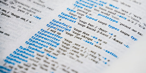
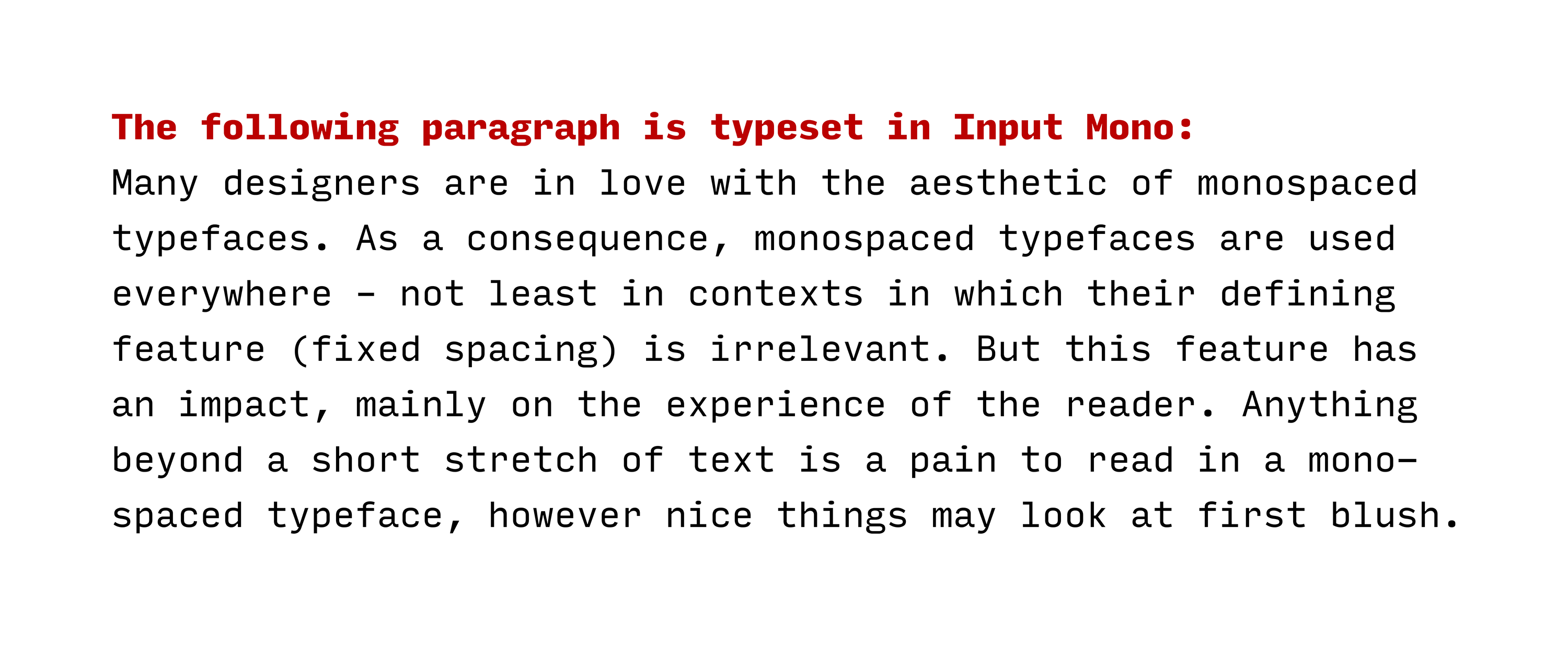
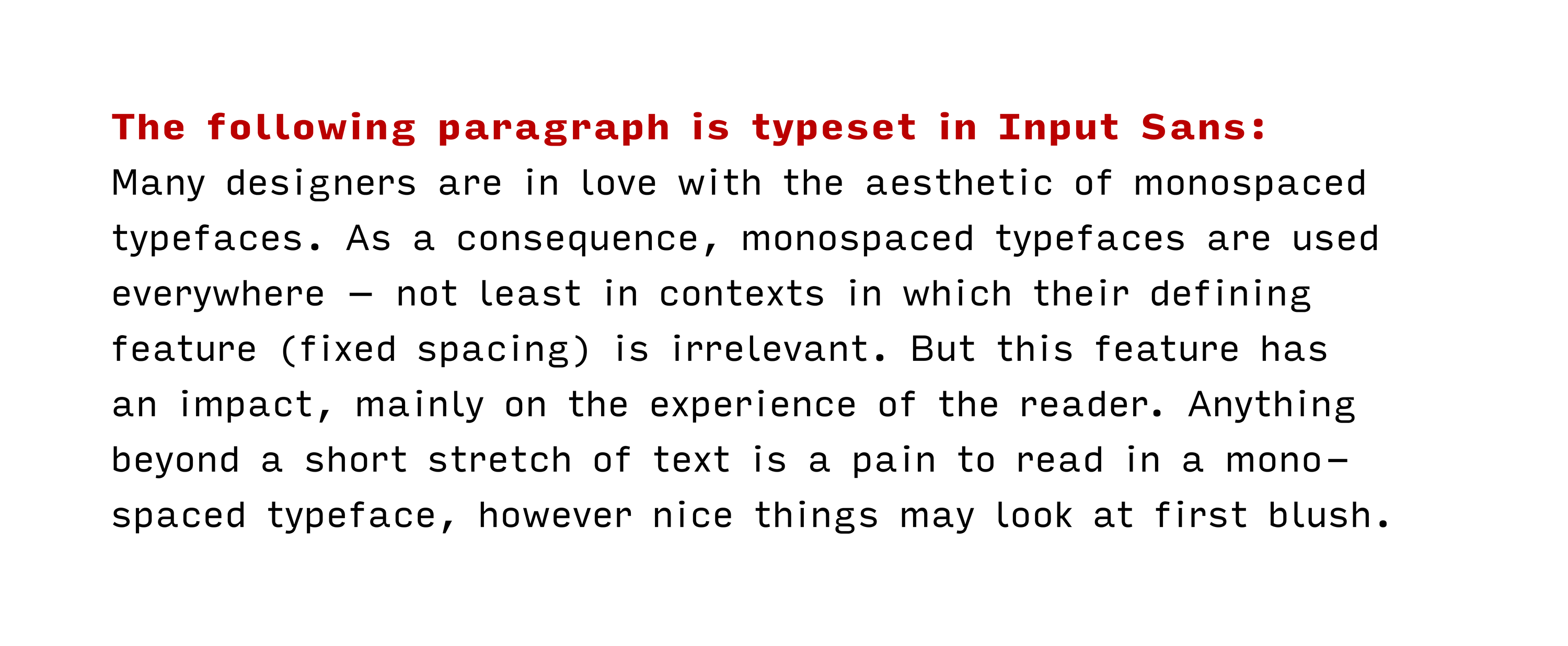
Many designers are in love with the aesthetic of monospaced typefaces (i.e., typefaces in which each character occupies the same amount of horizontal space, as opposed to proportionally spaced typefaces in which character widths are independent of one another). The appeal of these typefaces may stem from some kind of nostalgic association with typewriters or from their use in technical environments (computer terminals, programming etc.). Maybe it’s both. In any case, the fascination is there. As a consequence, monospaced (or fixed-width) typefaces are used everywhere – not least in contexts in which their defining feature (fixed spacing) is irrelevant. But this feature keeps on having an impact, mainly on the experience of the reader. In monospaced typefaces, glyphs have to be wider or narrower than in typefaces without the fixed-width constraint in order to fit everything in the space that is available while keeping the spacing optically balanced. The result is not what most designers would like to set a novel in and it’s not what most readers would like to read a novel in. Actually, anything beyond a short stretch of text is a pain to read in a monospaced typeface, however nice things may look at first blush.

A short paragraph, typeset in Input Mono, a monospaced typeface by David Jonathan Ross

Type designers have found a solution to this problem. It’s not a new solution, but it is a solution that I think deserves more attention (hence this post). Type designers have created typefaces that look like monospaced typefaces, but actually use proportional spacing. The benefit: Designers get to keep the look they love, but readers don’t have to go through the pain of a true mono. Such typefaces – some call them ‘monofaked’ or ‘fauxnospaced’ – are easier on the eyes than the ‘real thing’. It is a balancing act for type designers to keep enough elements of typical typewriter fonts in order to avoid losing the appearance, while at the same time making substantial improvements to reading ease.

A short paragraph, typeset in Input Sans, a proportionally spaced typeface by David Jonathan Ross

The first typeface that fits this description was apparently one called Bulletin Typewriter: Released in metal as a monospaced font, it became available with proportional spacing in phototype and transfer lettering formats. The earliest in-use example of the proportionally spaced Bulletin Typewriter I am aware of is from 1973. American Typewriter was released not much later. In the following list of other typefaces in this category, I will – as usual – apply a liberal interpretation of any relevant criteria: Any typeface that vaguely looks like a console or typewriter typeface (read more about this term in an article by María Ramos) has a ‘monospaced appearance’ in my book. For a change, the sorting will be chronological rather than alphabetical to emphasise developments in this genre.

Proportionally spaced typefaces with a monospaced appearance

  • 1973: Bulletin Typewriter by Morris Fuller Benton (Mecanorma)
    (The link refers to a digital version of the metal monospaced typeface, originally released in 1933 by ATF. A proportionally spaced version was only available in phototype and transfer lettering formats. It’s in the list mainly for reference.)
  • 1974: American Typewriter by Joel Kaden & Tony Stan (ITC)
  • 1989: Officina Sans & Serif by Erik Spiekermann & Just van Rossum (ITC)
  • 1996–98: Letter Gothic Text by Albert Pinggera (FontFont)
  • 1999: TypeStar by Steffen Sauerteig (FontFont)
  • 2000: Bs Monofaked by Mário Feliciano (Feliciano Type Foundry)
  • 2000: New Letter Gothic by Gayaneh Bagdasaryan (Paratype)
  • 2001: Courier Sans by James Goggin (Lineto)
  • 2007: Newsletter by Ingo Krepinsky (Die Typonauten)
  • 2008: Generika by Alexander Colby (Milieu Grotesque)
  • 2008: Lacrima Senza & Serif by Alexander Colby (Milieu Grotesque)
  • 2008–2010: Lekton by Luciano Perondi and students at ISIA Urbino (Google Fonts)
  • 2010: Typewriter by Henrik Kubel (A2-TYPE)
  • 2011: Hellschreiber Sans & Serif by Jörg Schmitt
  • 2011: Relative Faux by Stephen Gill & The Entente (Colophon Foundry)
  • 2011: Signika by Anna Giedryś (Google Fonts)
  • 2012: Anaheim by Vernon Adams (Google Fonts)
  • 2012: Executive by Gavillet & Rust (Optimo)
  • 2013: Documan by Martin Vácha (Displaay Type Foundry)
  • 2014: Input Sans & Serif by David Jonathan Ross (DJR)
  • 2014: Queue by Tal Leming (Typesupply)
  • 2014: Triplicate by Matthew Butterick
  • 2015: Clone by Lasko Dzurovski (Rosetta)
  • 2016: Millimetre by Jérémy Landes (Velvetyne Type Foundry)
  • 2016: Operator by Andy Clymer (Hoefler & Co.)
  • 2016: Proportional by George Triantafyllakos (Atypical)
  • 2017: Attribute Text by Viktor Nübel (FontFont)
  • 2017: Bitcount Prop by Petr van Blokland (TYPETR)
  • 2017: Comspot Tec by Nils Thomsen (TypeMates)
  • 2017: iA Writer Duospace (based on IBM Plex Mono by Mike Abbink & Bold Monday)
  • 2017: Ultraproxi by Ray Larabie (Typodermic Fonts)
  • 2018: Clincher Duo by Alexander Lubovenko (ParaType)
  • 2018: Covik Sans Mono by James Edmondson (OH no Type Co)
  • 2018: Drive Prop by Elliott Amblard & Jérémie Hornus (Black[Foundry])
  • 2018: Tuner by Simon Renaud (Production Type)
  • 2019: Recursive Sans by Stephen Nixon (Arrow Type)

This list started on Twitter. Thanks to Reed Reibstein, David Jonathan Ross, George Triantafyllakos, Daniel H., Dave Coleman, Anthony Masure, Martin Wenzel, Frank Adebiaye, Michael Piotrowski, Akira Yoshino, Eric Mellenbruch, Max Phillips as well as the people from Studio Het Mes, Fonts In Use and Displaay Type Foundry for suggesting typefaces. If you know of any additional typefaces that may qualify, please get in touch.

Welcome to @isoletters

On 1 January 2018, I will start sharing pictures of letters on a new Twitter account: @isoletters. I have been taking letter pics for years and occasionally shared them, for example on my @‌isoglosse Twitter account (which I will continue to use for anything except letter pics) or on Flickr. Browsing through my collection, I decided that I would like to share pictures from it more regularly. A collection is not worth much when nobody looks at the items and maybe gets inspired by them. For that reason, I will try to post one picture on each day of 2018. You are welcome to follow. I also hope that you will comment, correct me if I am wrong and share your own pictures. What kind of pictures can you expect?
Isoletters
All pictures I will share on @isoletters are of some typographic interest (or at least I think so). Given my own background, I may also slip in some pictures that are interesting from a linguistic perspective. When trying to classify the pictures I collected, one may end up with roughly the following categories:

Weiterlesen

Old type in new fonts? First impressions of Fontstore

A few days ago, Font­store launched – a new player in the market for subscription-based font services. To be accurate, Font­store is both a foundry and a font service provider: You can buy fonts there like at any other foundry, but you can also become a subscriber. For $ 15 per month (or $ 150 per year), you get access to their entire library of desktop fonts. Having used Typekit for a few years and having reviewed the Monotype Library Subscription (MLS) last year, I was curious to see what Font­store has to offer. The very first impression was not too favourable: Their website is slow and cluttered up with animations and effects, making it difficult to get an overview of their collection (others loved their site or also hated it). Font­store does not excel at transparency either: The name of its founder, Satya Rajpurohit, is nowhere to be found on the website (though he has promised to remedy this). In order to access the Font­store Library (the contents of which will be discussed below) through the subscription service, I subscribed and payed by credit card; both went without problems. Installing the app syncing the fonts on Windows was not exactly a seamless experience, though: I got a number of warnings that are typically not shown upon installing software, but just going ahead did not crash the system. Once installed, you go to the website, select the fonts you want to use, and they are available just seconds later.

Slim pickings for type designers

As I noted in my review of the MLS, low-priced font subscription services do not only raise technical questions, but ethical ones as well. Creating fonts is a time-consuming task requiring specialised skills that are gained through extensive training and practice. Few type designers create fonts just for the fun of it. Most do so to make (part of) a living – but you need a lot of subscribers before you are able to provide decent payment to all type designers. As a customer, you have to decide: Is subscribing to such a service tantamount to supporting exploitative working conditions and fuelling the downward price spiral in the font market? In the case of Font­store, the decision may be a little easier: All typefaces were commissioned for that service with (I presume) designers knowing what they signed for. In a post on TypeDrawers, Satya Rajpurohit, the founder of Font­store, explained that Font­store offers different payment models to type designers, neither of them based on royalties. In any case, the business risk mainly rests with Font­store, rather than with individual designers. That seems friendlier than royalty-based models, but $ 15 per month is still not much to go round, so time will tell if the system is sustainable. Also, even the best offer in a given situation can be a bad one: Font­store carries fonts from quite a few young type designers, some of them releasing their first retail fonts. Many senior designers may have been reluctant to accept Font­store’s payment models and have their fonts offered at a bargain price.

Weiterlesen

Identical zero and oh glyphs

Zero vs. oh: Strategies of glyph differentiation

When characters look similar to one another, misreadings or even misunderstandings may result. In such cases, type designers often try to avoid glyphs looking completely identical. One example of a similarity that can get too close for comfort is between the digit ‘0’ (henceforth: zero) and the letter ‘O’ (oh). Differentiation strategies between lining zero and upper-case oh have been shown to be fairly uniform across typefaces: Zero is almost always narrower and often less tall than Oh. These and other strategies have been discussed in a 2013 article by Charles Bigelow. He focuses on lining figures in typewriter typefaces and only briefly mentions contemporary approaches to non-lining zero and lower-case oh – a pair that is also prone to confusion and seems to be treated with less uniformity in recent typefaces. Inspired by a tweet by Shiva Nallaperumal, I have compiled typical and not so typical ways of distinguishing non-lining zero from lower-case oh. My observations are mainly based on old-style roman text typefaces in the Typekit library; this sample is not representative of anything but the Typekit library itself, which, however, contains a bunch of well-known, widely used typefaces.

Weiterlesen

Charis SIL, used in the Longman Pronunciation Dictionary

Fonts for phonetic transcriptions: An overview

In 2014, I started compiling a list of fonts for typesetting phonetic transcriptions using symbols of the International Phonetic Alphabet (IPA). It is probably the most comprehensive and up-to-date list of such fonts, providing short, yet detailed reviews of the typefaces and the quality of their symbols – but it has two disadvantages: First, the reviews are written in German, which most people do not read. Second, the list – featuring more than 40 typefaces – has grown quite long and maybe even a bit confusing. If you are looking for a decent sans-serif typeface that includes phonetic symbols in its bold style, the long list will not be much help. That is why created a table of all fonts for phonetic transcriptions I am aware of (thanks to Friedrich Althausen, the designer of the Vollkorn typeface, for the suggestion!).
Charis SIL, used in the Longman Pronunciation Dictionary by John C. Wells
For each font family, I have indicated whether the roman and italic styles in the regular and bold weights contain phonetic symbols (R: Regular Roman; I: Regular Italic; B: Bold Roman; BI: Bold Italic).¹ Whenever a typeface family includes more than these four styles, this is noted in the ‘More styles’ column (but you’ll have to look up the details for yourself). This is also true when a typeface has more than one bold weight (e.g., Semibold and Bold) or more than one italic style (e.g., ‘true’ italics and oblique). If you want to read the typeface reviews, click on their names (warning: German content ahead).

In each category,  means that a (more or less) complete set of phonetic symbols is available. Even if a font is marked that way, some symbols may be missing. (✓) means that a style or weight is present in the typeface, but that it does not contain phonetic symbols.  means that a style or weight is missing entirely from the typeface in question.² The last column contains a rating: This is not about whether a typeface is nice in general, but only refers to the completeness, drawing quality and functioning of the phonetic symbols. Please note that a five-star rating, used for the best typefaces in this area, does not imply that the typeface is absolutely complete and utterly flawless; minor deficiencies may remain. In any case, the rating is subjective, of course, so feel free to comment if your evaluation differs from mine. Also, please let me know if you know of any other typefaces with phonetic symbols.

Weiterlesen

Monotype Library Subscription: A user’s experience

MLS. That’s not the name of a tropical disease or some obscure government agency. The abbreviation stands for Monotype Library Subscription. Launched a few days ago, MLS is a subscription-based service that gives members access to “more than 9,000 fonts (2,200 font families)” (Monotype says). The price tag is at no more than €/$ 14.99 per month (or €/$ 119.99 per year). The fonts can be used in desktop applications, but – unlike the fonts on Typekit, a competing service by Adobe – not on websites.

For graphic designers, this sounds like a good deal. €/$ 14.99 per month for high-quality typefaces is next to nothing. A regular licence of most typeface families available through the MLS would cost twenty times as much or more. The choice seems ample: The library, Monotype says, features “reliable workhorses” (such as Avenir Next), “unique choices” (such as Ginkgo, Linotype’s take on the Dolly genre) and “attention grabbing” typefaces (such as Balega). Let’s be clear, though, that most of what you get is hardly at the cutting edge of contemporary type design. Innovation happens elsewhere. This may be a deal breaker for all those who are trying to produce fresh or even innovative work. In that industry, Rockwell (released in 1934 and based on earlier models) probably won’t count as ‘attention grabbing’ any more and Oranda (from the mid-80s) does not qualify as ‘unique’. That may be less of a concern for those interested in subdued text typography: MLS includes a number of modern classics that have aged with grace and can still be used nicely (such as Caecilia), along with some good recent releases (such as Quire Sans). It helps, by the way, if you only need to use Latin-based alphabets: For those, the language support of most typefaces is good. For Greek, Cyrillic or Arabic, not so much.

Weiterlesen

Bram de Does (1934–2015): “Ik sta schaakmat”

On 28 December 2015, Dutch type designer and typographer Bram de Does (* 1934) passed away. Jan Middendorp (@DutchTypeJam) honoured him by posting a picture in which we see text handwritten by De Does. The text is a reply to a comment that Peter Matthias Noordzij made on the letter ‘k’ of a custom headline version of De Does’ Lexicon typeface. The reply is in Dutch, so I tried to translate it to English:

“I can understand that you find it [the letter ‘k’] ugly. I do not manage to find it really beautiful either, but still do not know what I could improve in it. I do not want to make the bottom serif on the right any wider; ‘k’ already leaves such a large gap on the right-hand side. I do not want to make the upper right-hand part extend more to the right because this would cause these white spaces [cf. picture] to differ so much. I do not want to lower the junction in the middle because the space labelled ‘b’ would become even smaller then. Do you have any ideas? I am checkmated.”

In the third, fourth and fifth sentence, De Does uses object-initial constructions in Dutch, which are difficult to render in English. A construction that uses left dislocation probably comes closest in English: ‘The junction, I don’t want to lower it’ – but that does not sound particularly natural to me.

Under the type volcano: A review of the 2015 Typodarium

On each day of 2015, I tweeted a micro-review of the typefaces in the Typodarium, a tear-off calendar (published by Hermann Schmidt, Mainz – a city with some typographic heritage, as you may know). If you would like to (re)read these 365 tweets, have a look here. In this review, I will focus on the editorial concept of the calendar, rather than on the individual typefaces. But isn’t it pointless to review a calendar for a year that just ended? Maybe it isn’t. There have been rumours that the 2016 Typodarium may be the final one (but the editors of the Typodarium have made a post to their Facebook page saying: “see you next year for the issue #9”). Whether or not this specific product is (almost) dead, the general idea of a daily type calendar should not die. A physical calendar for your physical desktop still seems like an enjoyable way of getting to know new and interesting typefaces. In this review, I will try to point out some aspects that may have rendered the 2015 Typodarium – however much I enjoyed tweeting about its typefaces – less worthwhile than it could have been. If you ever consider publishing a daily type calendar, take a good look at each edition of the Typodarium, read this review – and make it better.

The first Typodarium edition was published in 2008 (for 2009). All editions were edited by Lars Harmsen and Raban Ruddigkeit. In recent years, a jury helped selecting the typefaces. The jury for the 2015 edition were Philippe Apeloig, Alexander Branczyk, Martina Flor, Ivo Gabrowitsch and Mario Lombardo. Three of the five jury members have published retail typefaces themselves (Ivo Gabrowitsch has not, as far as I know, and Mario Lombardo has designed exclusive custom typefaces). It is sad to see only one female type designer among four men, but not surprising, given a lack of gender diversity in professional type design. In spite of that, this is a competent jury, so I was surprised to find that two of the calendar’s main weaknesses were caused by what I think is an unduly lenient editorial policy.

Weiterlesen

Straatnaamborden in Groningen: aanvullende inzichten

Het is bijna vier maanden geleden dat ik twee stukjes over de vormgeving van straatnaamborden in de stad Groningen heb geplaatst. Al kort na de publicatie van die twee artikelen heeft Rob Essers contact met me gezocht. Rob is de samensteller van een (hele fijne want complete en actuele) stratenlijst van de gemeente Nijmegen. Dat de aandacht van de samensteller van zo’n stratenlijst op een gegeven moment ook op straatnaamborden valt, zal niemand verbazen. En wat blijkt? In Nijmegen hangen er straatnaamborden die vrijwel identiek zijn aan een type Groningse straatnaamborden dat ik in een van mijn artikelen heb beschreven: het gaat om de donkerblauwe straatnaamborden die in de binnenstad nogal frequent zijn en waarvan ik denk dat dit type borden het tweede oudste is.
Verlengde Visscherstraat
Op noviomagus.nl – een “geschiedeniswebsite over Nijmegen” (de Romeinen noemden Nijmegen ‘Ulpia Noviomagus Batavorum’) – zijn een aantal rijksmonumenten in die stad beschreven waaronder een pand in een straat met de naam ‘Ganzenheuvel’ (kijk even hier). De foto’s laten borden zien waarop, net als op de borden in Groningen, een smalle classicistische letter staat. In Nijmegen zijn de borden ingemetseld, maar in allebei de steden gaat het blijkbaar om borden van geëmailleerde lava. “Het materiaal is opvallend licht van gewicht”, schrijft me Rob Essers die één van die borden eens in handen heeft gehad. Op Noviomagus schrijft hij verder dat er “nog maar heel weinig borden van dit type in Nijmegen bewaard” zijn gebleven – terwijl er in Groningen best veel van hangen (zie mijn Flickr-collectie).

Naast het feit dat Groningen niet de enige stad is waar dit soort borden hangen, heeft Essers nog twee details weten te ontdekken: ten eerste heeft hij een bord van dit type gevonden waarop een straatnaam staat die sinds september 1886 niet meer in gebruik is. Hierdoor weten we dus dat dit soort bordjes vóór die tijd al in Nijmegen hing (en wellicht ook in Groningen). In mijn eigen artikel was ik, bij gebrek aan oude(re) foto’s, van omstreeks 1900 uitgegaan. Heel interessant dat de weinige Nijmeegse bordjes die er nog zijn van dit type, en wie weet ook (sommige van) de Groningse bordjes al zo oud zijn!

Ten tweede heeft Essers aanwijzingen waar de Groningse straatnaamborden vandaan kwamen. Die aanwijzingen komen uit de correspondentie van de Middelburgse stadsarchitect met het bedrijf dat in 1885 straatnaamborden voor deze stad zou leveren. Uit deze correspondentie wordt geciteerd in een artikel dat al tien jaar geleden in De Wete is gepubliceerd, het tijdschrift van de Heemkundige Kring Walcheren: een zekere François Gillet uit Parijs schrijft aan de stadsarchitect dat zijn bedrijf reeds straatnaamborden naar Nijmegen heeft geleverd. Het lijkt me aannemelijk dat alle Nijmeegse straatnaamborden uit die tijd door hetzelfde bedrijf zijn geleverd (en niet door een concurrent van Gillet). Aangezien de Nijmeegse bordjes identiek zijn aan de Groningse bordjes van het type dat ik boven heb laten zien, zouden we ervan uit kunnen gaan dat de borden in allebei de steden door Gillet zijn gemaakt. Van de Middelburgse bordjes uit die tijd staan er helaas geen plaatjes in het Wete-artikel (of er zijn gewoon geen borden meer uit die periode). Wel zijn er een aantal foto’s van andere Middelburgse borden die sterk lijken op het tweede type borden dat ik hier heb beschreven. Het gaat om de afgeronde borden met de geometrische schreefloze letter die ook zo’n beetje overal in het centrum van Groningen te zien zijn.
E. Thom à Thuessinklaan
Met het oog op het letterontwerp kunnen we uitsluiten dat de correspondentie uit 1885 over dit type borden ging. Wel zou het mogelijk zijn dat Middelburg het huis Gillet trouw is gebleven, dus dat ook latere borden uit Parijs kwamen. Als we wisten of dit zo was (of hoe de 19e-eeuwse bordjes in Middelburg eruitzagen), zou dat aanvullend licht op de oorsprong van de Groningse borden werpen. Uit de correspondentie van Gillet met de stadsarchitect blijkt in ieder geval dat het bedrijf niet alleen maar Nijmegen en Middelburg van bordjes heeft voorzien. Borden uit Parijs zouden in Parijs zelf, maar ook elders in Frankrijk (Lyon, Versailles, Le Havre, Cherbourg, Le Mans, Calais, Boulogne, Lille, Roubaix, Duinkerken) en in enkele steden in het Nederlandse taalgebied (Gent, Arnhem, ’s-Hertogenbosch) hangen of hebben gehangen. Misschien zijn er in een van deze steden zowel plaatjes van borden uit de 19e eeuw als gegevens over hun herkomst. Nog steeds geldt: als je meer weet, hoor ik het graag.