
On 1 January 2018, I will start sharing pictures of letters on a new Twitter account: @ isoletters. I have been taking letter pics for years and occasionally shared them, for example on my @isoglosse Twitter account (which I will continue to use for anything except letter pics) or on Flickr. Browsing through my collection, I decided that I would like to share pictures from it more regularly. A collection is not worth much when nobody looks at the items and maybe gets inspired by them. For that reason, I will try to post one picture on each day of 2018. You are welcome to follow. I also hope that you will comment, correct me if I am wrong and share your own pictures. What kind of pictures can you expect?
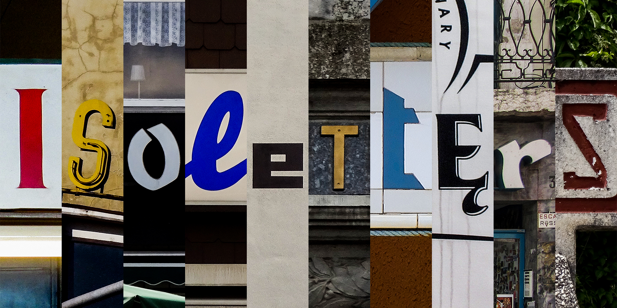
All pictures I will share on @ isoletters are of some typographic interest (or at least I think so). Given my own background, I may also slip in some pictures that are interesting from a linguistic perspective. When trying to classify the pictures I collected, one may end up with roughly the following categories:
-
Excellence and extravagance
When letterers or typographers do great work, this deserves sharing and praising. We won’t come to a universal agreement on what exactly is excellent. But I hope that you will agree that quite a few of the letters I will show are pleasant to look at. Many of the makers of these letters are anonymous – or they may even be dead. That shouldn’t keep us from appreciating their work, but it is especially with regard to this category that I would like to encourage all readers to let me know if you know who created any lettering, type or composition featured on my account. I wouldn’t mind getting in touch with the creators of some of the work I will show or learning more about them. Luckily, enjoying the letters doesn’t require knowing everything about their making. That’s what this category is for.
-
Local colour
Letters shape our world – and just like many other things, they look different in each place. Sure, Arial and Times New Roman are almost everywhere (the way McDonald’s and Coca-Cola are). But most places have retained a certain couleur locale that is enjoyable to discover and observe. That is why a German Bäckerei usually does not look the same as a French boulangerie. And a Dutch bakkerij will look different still (if you can find one). This category is meant to celebrate these differences. A large share of the pictures I have collected fall within this category. There may be a pinch of excellence in some of the examples; some others may seem a bit bland at first sight. What the examples in this category have in common is that I have perceived them as typical elements of the local visual culture. This category also includes pictures of local variants of letters or diacritics. This is a phenomenon that has received some more attention lately and I am happy to make my contribution.
-
Abomination and abhorrence
In this category, I collect lettering and type that had my eyebrows raised. Again, your mileage may vary (and if it does, feel free to let me know). In any case, this is supposed to be the category with the fewest items. I don’t see much of a point in highlighting subpar work. There is so much of it. You just have to take a stroll through any random town to get a year’s fill. But even bad stuff can be worth looking at – for instance, when it is funny (the fact that Comic Sans was used won’t suffice) or instructive (consider this example I posted on my @isoglosse account). I won’t specifically label these cautionary examples, but you should know that not everything I feature is worth imitating.
If you would like to know more about the pictures that will be posted, have a look at the account itself. On the first day of the year, I will post one picture per hour under the hashtag #Lttr18 to give you an idea of the road that lies ahead. But to be honest, I don’t know yet which picture will be posted on 31 December 2018, so don’t hold it against me if I don’t exactly follow the path I have set out.
Finally, some technical remarks: People have inquired why I have decided on Twitter for sharing the pictures. Twitter seemed like a good compromise in terms of image quality and reach. It is used widely in the type community and can even be accessed by people who don’t have an account themselves. It is true that file size limits apply and that pictures are compressed upon upload. The result is acceptable for the intended purposes, though. I hope to upload all pictures to Flickr as well (which is better in terms of quality and tagging, but used by fewer people), but that may take a while. The pictures on @isoletters are licensed under CC BY-NC-ND. If you need higher-resolution files or would like to use the pictures for anything that goes beyond the license, please get in touch with me.
By the way: If a non-twitter user wants the tweets of @isoletters delivered without visiting the twitter page everyday then an RSS feed for example by Twitrss.me could be used. Simply copy the address https://twitrss.me/twitter_user_to_rss/?user=isoletters into your feed reader or supporting mail program (e. g. Thunderbird) and daily receive at least a preview of each picture automatically.
Excellent suggestion. I wasn’t aware of this possibility. Thanks for mentioning it!