Typeset letters of the Latin alphabet are typically unconnected – such as the ones you are reading right now. There are typefaces in which letter shapes (glyphs) appear mostly connected (e.g., styles mimicking handwriting or calligraphy). In this piece, though, I will focus on typefaces in which most glyphs are not connected to their neighbours, but separated from them by a certain amount of white space.
Even in such typefaces, there are cases in which letters are represented by a connected shape. This is referred to as a ligature. There are two common reasons for using ligatures: First, the juxtaposition of letters in a word can lead to an overlap of shapes that is considered aesthetically displeasing by the designer. Adding more white space between the shapes does not always resolve the problem in a way that is seen as satisfactory. Sometimes it is perceived as a better solution to merge the overlapping shapes into one shape that represents several letters. Second, ligatures can also be used for decorative purposes, when shared shapes are created for letters that normally would not overlap.
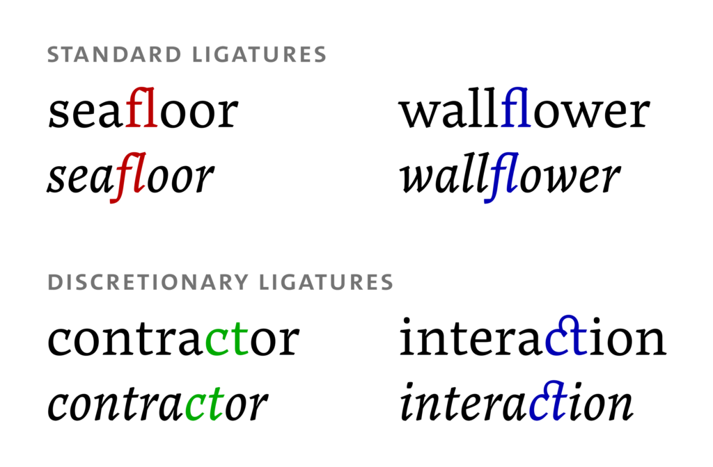
In digital typesetting, a ligature that deals with an unwanted overlap is referred to as a ‘standard’ ligature (OpenType feature liga) – shown in the top part of the picture below. The overlapping glyphs are highlighted in red; the ligature glyph in which the accidental overlap is replaced by a smooth connection is highlighted in blue. A decorative ligature is a ‘discretionary’ ligature (OpenType feature dlig) – shown in the bottom part of the picture. The glyphs highlighted in green do not overlap; when a connecting element is added, this leads to the blue ligature glyphs. Discretionary ligatures are often used sparingly and, as the name indicates, at the typesetter’s discretion. Their use will not be discussed here. (The serif typeface used for all the samples in this article is Noort by Juan Bruce.)
In this piece, I would like to argue the following:
- It is preferable to avoid standard ligatures (i.e., ligatures used for dealing with glyph overlaps) and to handle overlaps in a way that keeps letter shapes unconnected.
- If standard ligatures are used, their use must be in line with language-specific structural rules. Unconnected alternatives must be provided for all ligature pairs.
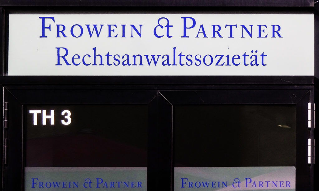
With respect to the first point, we have already noted that unconnected letters are the default in many typefaces. Connected letters are therefore exceptions in these typefaces. They also look like exceptions. Merging two letter shapes into one often results in a glyph whose shape differs from the shapes of the isolated letters. While the magnitude of the difference may vary, many ligatures are perceptibly different from the majority of surrounding unconnected letters. (The picture below shows a ct-ligature – a discretionary ligature, admittedly – used as an ampersand, which suggests that the person who made this sign had a hard time making sense of ligature glyphs.) Readers can deal with letters that look different – but when the shapes of letters differ from those of other letters, this is typically associated with some informational value: If a word is represented by fatter shapes than surrounding words, this suggests that the word is more important than surrounding words. For slanted or cursive shapes, it may be some other semantic nuance that is expressed by the difference. In any case, shapes that stand out usually stand out for a reason – or at least this is the way it should be in good design.
This is not the case, though, with connected letter shapes: They are connected – and therefore look different – due to the mere fact that the isolated shapes of the letters they represent happened to overlap in a way that was considered ugly by the designer of the typeface in question. But this is not a relevant fact for the person reading these letters. It is a semantically empty difference that may confuse readers. Admittedly, we do not know if ligature glyphs whose shapes differ from the shapes of the isolated letters they represent are confusing indeed and, if so, to what degree. We can be certain, though, that there is no functional advantage to using ligatures. Readers may be mostly unfazed by them, but they can never benefit from them. And if there is no benefit in using ligatures, it may be time to get rid of them.
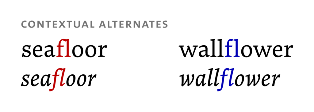
In order to avoid interspersing a text with meaninglessly different shapes, other strategies of dealing with shapes that overlap in an undesirable way have to be used: One of them is altering letter shapes in a way that leaves them unconnected, while still removing the unwanted overlap. Shapes can be altered globally (i.e., if a letter shape tends to crash into many other shapes, replacing it by a shape that generally produces fewer collisions is an option). They can also be altered contextually (i.e., if a letter shape crashes into one specific other shape, the shape or shapes can be replaced by non-colliding shapes in that specific pair). For producing the latter effect, the ligature feature of fonts could even be used – but the result will not be a ligature glyph. In the picture below, there is a glyph collision in the ‘fl’ pair on the left-hand side, highlighted in red. The collision does not occur in this pair when ‘f’ is represented by a glyph that has a shorter beak, shown in blue on the right-hand side. Whatever strategy is chosen on a technical level, my main point is that overlaps should be resolved in a way that avoids producing glyphs whose deviant shapes are salient, but never in an informative way, and therefore potentially confusing.
Ligature glyphs are part of a typographic tradition, so calling for them to be replaced by non-overlapping contextual alternates is not going to end that tradition – not today or tomorrow, at any rate. I would therefore like to expand upon the ramifications of having random connected letters in a text.
In Latin typesetting, the morphological structure of a word (i.e., the internal composition of a word from smaller meaningful units) is rarely marked. However, there are typographic means that can be used for clarifying the structure of a word – hyphens, for instance: The English word ‘coworker’ can be hyphenated as ‘co-worker’, but it does not have to be. One thing is certain, though: If such structure markers are used, they may never be used in a way that suggests an incorrect segmentation of a word. ‘Coworker’ may never be hyphenated as ‘cow-orker’ (unless you are referring to a person who orks cows). In ligatures, a similar issue arises: When ligatures are used, they ligate – or, in other words, tie together – the shapes of certain letters. We have seen above that this concerns random letters and that the distribution of ligatures in a text is uninformative for the reader. It can be difficult, though, for readers to ignore information or what looks like information, even if it is irrelevant. If some letters are connected in a typeface that mostly uses unconnected letters, the connected glyphs look like information and may even suggest a link between these letters on some level. This could be on a phonological level (i.e., if letters are connected, they are part of the same syllable) and, by extension, morphological (i.e., if letters are connected and part of the same syllable, they are part of the same morpheme).
In the worst case, this leaves us with randomly distributed ligatures suggesting equally random connections between letters suggesting equally random bits of (incorrect or unreliable) information about the phonological and/or morphosyntactic structure of words. To a perceptive reader, this may well be confusing. Again, we do not know if it is confusing and, if so, to what degree – but again, we can be certain that ligatures, when distributed randomly and indiscriminately throughout a text, have no beneficial effect on reading, segmentation and comprehension. This is where a traditional German typesetting rule comes in. It stipulates that ligatures must never be used across morpheme boundaries (with some exceptions). This is an attempt at barring the use of ligatures in cases where using them may send an incorrect signal with respect to the connection of letters and the structure of the word.
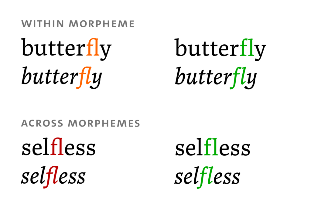
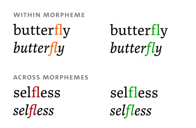
As I argued above, ligatures could easily be removed altogether from the typographic landscape of many texts. But if they are used, their use should be restricted to cases where they correctly suggest a link between certain letters on a phonological or morphological level. Here is an example: In the English word ‘butterfly’, the letters ‘fl’ are part of the same syllable and the same morpheme (namely ‘fly’). Ligating these two letters is unnecessary, as many other letter pairs that are also part of the same syllable and morpheme remain unligated and as ligating random letters may be confusing in itself. But if we accept the existence of ligatures, the confusion that could arise from connecting letters that are indeed part of the same syllable and the same morpheme – such as the letters ‘fl’ in the word ‘butterfly’ (highlighted in orange in the picture below) – seems comparatively small. In the English word ‘selfless’, by contrast, the letters ‘fl’ (highlighted in red below) are not part of the same syllable and the same morpheme. Connecting them is not only unnecessary, but potentially confusing, as it seems to suggest that ‘fless’ is the final syllable or morpheme of the word – which it is not. In fact, the two letters are just neighbours. They are neither related in any way nor part of the same syllable nor part of the same morpheme. (‘Self’ and ‘less’ are the syllables and morphemes of the word.) Contextual alternates, shown on the right-hand side of the picture below and highlighted in green, can be used in both cases.
Here is my suggestion: In order to avoid confusion, ligatures should never be used when the affected letters are not part of the same phonological or morphological unit. (Relevant units may differ between languages.) This brings us back to the first point: In a situation where ligatures are not used indiscriminately or, more specifically, not used in certain contexts, type designers have to make sure that there is an alternative – for pairs like ‘fl’ in ‘selfless’. There has to be a way for typesetting potentially overlapping shapes while avoiding both ugly overlaps and potentially confusing ligatures. If type designers provide for that, typesetters will be able to decide freely about how to handle overlapping glyphs.
Why is this important? Type design and typesetting are industries where inordinate amounts of time are spent doing things that are likely to go unnoticed by typical users of the products of those industries. Type designers and typesetters do these things nonetheless – because they believe that these are the right things to do (and on the off chance that somebody may notice them or even benefit, at least on an unconscious level). This case is no different than massaging the northeastern part of the curve of a ‘þ’ glyph to iron out a kink that an untrained eye may not even have seen. As I have argued, abandoning ligatures or at least using them more judiciously than most do now makes sense on a theoretical level – in other words: I think it is the right thing to do and somebody may benefit. If any testing can tell us if it makes sense on a practical level as well, I would be happy to learn about the results.
Apart from arguing for increased efforts to use (and offer) non-joining solutions to glyph collisions on the one hand and for a more judicious use of ligatures on the other, I would also like to compile a list of typefaces in which critical letter pairs are dealt with gracefully without resorting to ligatures. This list does not exclude typefaces that additionally contain ligature glyphs, but it does exclude typefaces in which ligature glyphs are the only way in which glyph overlaps are handled. Typefaces in which letter shapes do not overlap to begin with are excluded as well (which is true for many sans-serif typefaces, so the list will be heavy on serifs). If you are aware of any other typefaces that qualify, please let me know. (Note: The letter pairs for which non-joining glyphs are available may differ between the typefaces.)
- Actium (Gerben Dollen; Type Mafia)
- Aspen (Ludwig Übele; LudwigType)
- Baskerville Original (František Štorm; Stormtype)
- Brenta (Ludwig Übele; LudwigType)
- Cormorant (Christian Thalmann; Google Fonts)
- Darby Sans (Paul Barnes & Dan Milne; Commercial Type)
- Diogenes (Ludwig Übele; LudwigType)
- Domus (Tim Ahrens & Shoko Mugikura; Just Another Foundry)
- Facit (Tim Ahrens; Just Another Foundry)
- Fazeta (Andrej Dieneš; adtypo)
- Garibaldi (Henrique Beier; Harbor Type)
- Gemma (Rob Keller; Mota Italic)
- Jannon 10 Pro (František Štorm; Stormtype)
- Kakadu (Ludwig Übele; LudwigType)
- Koning (Luc[as] de Groot; LucasFonts)
- Lapture (Tim Ahrens; Just Another Foundry)
- Lyon (Kai Bernau; Commercial Type)
- Marco (Toshi Omagari; TypeTogether)
- Marat & Marat Sans (Ludwig Übele; LudwigType)
- Marr Sans (Paul Barnes & Dave Foster; Commercial Type)
- Meno (Richard Lipton; Lipton Letter Design)
- Mokka (Ludwig Übele; LudwigType)
- More (Łukasz Dziedzic; FontFont)
- Niko (Ludwig Übele; LudwigType)
- Noort (Juan Bruce; TypeTogether)
- Nordvest (Nina Stössinger; Monokrom)
- Parisine (Jean-François Porchez; Typofonderie)
- Satyr (Sindre Bremnes; Monokrom)
- Serge (Cyrus Highsmith; Occupant Fonts)
- TheAntiqua (Luc[as] de Groot; LucasFonts)
- Traction (Christian Thalmann, Miriam Surányi & Chiara Mattersdorfer; Schriftlabor)
- Trilby (David Jonathan Ross; DJR)
- Tundra (Ludwig Übele; FontFont)
- Turnip (David Jonathan Ross; DJR)
- Vollkorn (Friedrich Althausen)
- Walbaum 2010 Pro (František Štorm; Stormtype)
- Ysabeau (Christian Thalmann)
I have read the article “The selfless butterfly. Or: Using and avoiding ligatures.” at https://www.isoglosse.de/2020/04/the-selfless-butterfly-or-using-and-avoiding-ligatures/
I used Firefox 75 on a Windows 10 laptop.
Though I normally turn ligatures on, I am sympathetic to the argument.
(1) “… an overlap of shapes that is considered aesthetically displeasing by the designer”
The ligature is aesthetically pleasing because it looks like “the real thing”: moveable type. My generation grew up with this as the ideal, but I expect this to change.
I believe the ligatures like “fi” were introduced for moveable type printing: overlapping letters meant that two pieces of metal would have had to occupy the same space simultaneously. The problem did not exist in handwriting, because the pen was in the same place at different times. It does not exist either for digital type.
(2) “Shapes can be altered globally (i.e., if a letter shape tends to crash into many other shapes, replacing it by a shape that generally produces fewer collisions is an option).”
Nicolas Jenson tried this in 1470 with his famous roman typeface in which the tittle of the “i” is offset to the right. It is not surprising that everyone rejects his solution.
(3) I am sorry to say that what irritated me in the article was the hyphenation at the ends of lines. The worst offenders were:
mimi-cking desi-gner ligatu-re Un-connected in-formational Ad-mittedly in-formation ru-le in-correct re-sorting
I expect that other readers will find different words hyphenated, depending on screeen size, text size, browser etc.
In order to avoid confusion we should use a better method of justifying paragraphs.
A prime example of a word where ligatures can be very confusing: the Dutch “fijn” – as illustrated in this very sentence. This looks completely wrong, and could easily be remedied with a bit of OpenType magic.