Von der Leyen Commission: Names and pronunciations

This is a list of the commissioners of the von der Leyen Commission, the European Commission in office from 1 December 2019. For each commissioner, the name is given in the original script and, if need be, in Latin transcription. The portfolio and the country of origin are given in English. Each name was transcribed using the symbols of the International Phonetic Alphabet (IPA): The first transcription indicates the pronunciation as it can be heard in the country of origin of the commissioner. Where applicable, German and English approximations of the original pronunciation are suggested.

I would not have been able to compile this list without the help of many others. Thanks to all of them! All remaining errors are mine, of course. Corrections, suggestions or suggestions of corrections are highly welcome. Some additional information on the transcriptions can be found below the list.

Ursula von der Leyen
President   |   🇩🇪 Germany
Original pronunciation: [ˌʊʁzula ˌfɔn ˌdeːɐ̯ ˈlaɪ̯ən] or [ˈfɔn ˌdeːɐ̯ ˌlaɪ̯ən]
English pronunciation: [ˌɜːʳsjələ ˌvɒn ˌdəʳ ˈlaɪ̯ən] or [ˈvɒn ˌdəʳ ˌlaɪ̯ən]

Frans Timmermans
Climate Action (Executive Vice President)   |   🇳🇱 The Netherlands
Original pronunciation: [ˌfɾɑns ˈtɪmɚmɑns]
English pronunciation: [ˌfɹæns ˈtɪməʳmənz]
German pronunciation: [ˌfʁans ˈtɪmɐmans]

Margrethe Vestager
Competition (Executive Vice President)   |   🇩🇰 Denmark
Original pronunciation: [mɑˌɡ̊ʁeːˀd̥ə ˈʋɛstæːˀɐ]
English pronunciation: [məʳˌɡɹeɪ̯tə ˈvɛsteɪ̯əʳ]
German pronunciation: [maɐ̯ˌɡʁeːtə ˈʋɛstɛːɐ]

Weiterlesen
Uitspraak van de ‘g’ in Engelse leenwoorden in het Nederlands

Met de ‘g’ van ‘googelen’

Het Nederlands is een rare taal – althans, als je het vanuit het perspectief van zijn buurtalen bekijkt. Anders dan het Duits, Engels of Frans heeft het Nederlands geen foneem /ɡ/ (behalve in een aantal vrij recente leenwoorden). De letter ⟨g⟩ die in veel andere talen voor het foneem /ɡ/ staat, duidt in het Ne­der­lands meestal het foneem /ɣ/ aan. De fonetische realisatie van dat foneem varieert: in het noorden, oosten en westen van het taalgebied is het meestal [χ], in het zuiden kan het [ɣ] of  [ʝ] zijn en in het zuidwesten zelfs [ɦ]. Aan het einde van een woord worden al die klanken stemloos uitgesproken (voor zover ze dat niet sowieso al zijn). Hoe dan ook, het komt erop neer dat sprekers van het Nederlands die de letter ⟨g⟩ zien, waarschijnlijk niet direct de neiging zullen hebben om die als /ɡ/ uit te spreken. Maar Ne­der­landers spreken talen waarin er wél een foneem /ɡ/ is dat door de letter ⟨g⟩ wordt weergegeven. En ze weten heus dat hun taal een beetje gek doet in vergelijking met alle buurtalen. Wat gebeurt er dus als een woord met een ⟨g⟩ de grens oversteekt? Zo’n woord is ‘goal’ (doelpunt), ontleend aan het Engels. Dat wordt vaak gebruikt als voorbeeld van een woord dat in het Nederlands met /ɡ/ wordt uitgesproken. Hier is in het verleden al onderzoek naar gedaan (van Bezooijen & Gerritsen, 1994); daaruit bleek dat het woord ‘goal’ door rond een derde van de ondervraagde sprekers met een /ɣ/ werd uitgesproken. Alle sprekers die aangaven dat ze ‘goal’ met een /ɣ/ uitspreken, waren uit het zuiden van het taalgebied afkomstig (Valkenburg in Nederlands-Limburg of Tielt in het Belgische West-Vlaanderen). Dat zijn resultaten van 25 jaar geleden; ik weet niet of er nieuwer onderzoek naar de uitspraak van dat woord is.

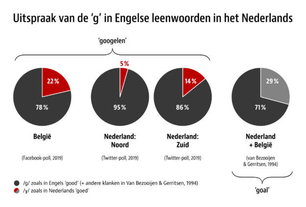
En hoe zit het met nog recentere ontleningen? Laatst werd ik door Duitsers gevraagd hoe je het woord ‘googelen’ (op internet zoeken met behulp van de zoekmachine Google) in het Nederlands uitspreekt. Zijn die maffe westerburen zo gek om hun ‘eigen’ /ɣ/ te gebruiken en ‘choechelen’ te zeggen? Ik had die uitspraak nog nooit gehoord. Korte navraag bij een moedertaalspreker uit Noord-Nederland (Drenthe, Groningen) leerde dat ook hij de uitspraak met een /ɡ/ prefereerde. Maar, zei een van mijn Duitstalige kennissen, op de Nederlandse Wiktionary staat dat het woord in Limburg wel degelijk met een /ɣ/ wordt uitgesproken. Die transcriptie staat er al sinds 19 juli 2009, toegevoegd door de gebruiker Oos­westhoesbes – zonder enige bronvermelding. Maar hoe zit het echt? Zou die gebruiker gelijk hebben en zeggen Limburgers inderdaad een /ɣ/ in dat woord? Ik heb geen definitief antwoord op deze vraag, maar wel wat data tot mijn beschikking die op sociale media zijn verzameld. We zijn ons allemaal bewust van de beperkingen van het verzamelen van data via social media. Aangezien dit geen weten­schappelijk onderzoek is maar een blogje, ga ik daar verder geen aandacht aan besteden. De grootte van het korreltje zout waarmee de resultaten moeten worden genomen, mag iedereen zelf bepalen.

Weiterlesen
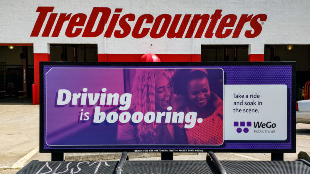
Plakat von WeGo Public Transit, der Verkehrsgesellschaft von Nashville, mit dem Text ›Driving is booooring‹

It is possible to get on a bus. Oder: ÖPNV in the USA.

Von was, das es woanders auf der Welt gibt, aber nicht in dem Land, in dem du lebst, würdest du dir wünschen, dass es das auch bei dir gäbe? Wenn diese Frage gestellt wird, ist die Antwort, die ich von US-Amerikanern gehört und gelesen habe, oft dieselbe: einen öffentlichen Personennahverkehr ›wie in Europa‹. Aber was ist eigentlich der Unterschied? Vor ein paar Wochen bin ich in Düsseldorf in ein Flugzeug gestiegen und in Nashville, Tennessee aus einem anderen Flugzeug. Meine Eindrücke, die auf Beobachtungen am Start- und Endpunkt dieser Reise beruhen, geben einen Einblick in das, was links des Atlantiks anders ist als rechts davon – zumindest dann, wenn man in einen Bus steigt.

Panorama der Innenstadt von Nashville
Weiterlesen

›Kriege und Brände überstanden‹: Der Quadenhof in Gerresheim

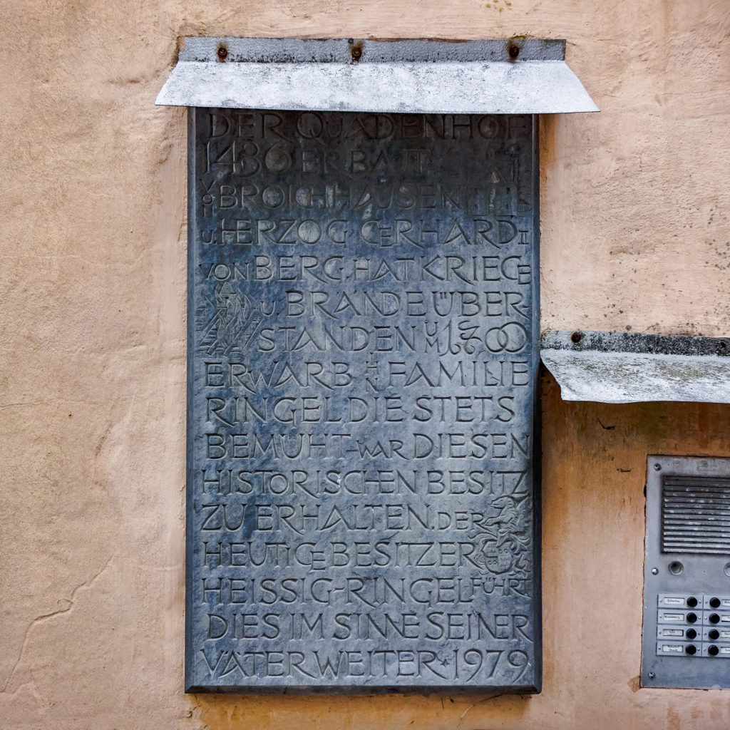
Wer die Düsseldorfer Innenstadt in gerader Linie gen Osten verlässt und erst anhält, wenn die Orts­schilder fast schon ›Erkrath‹ zeigen, befindet sich wahrscheinlich in Gerresheim: einst eigenständige Kleinstadt, seit 1909 Stadtteil von Düsseldorf. Wer vom zentral in der Altstadt gelegenen Gerricusplatz in einen schmalen Durchgang abbiegt, steht vor dem Quadenhof, einem im Stil der Spätgotik gehaltenen Adelssitz aus dem Jahr 1436. Und wer dann nach links blickt, sieht eine Tafel, die in aller Kürze die Geschichte und Besitzverhältnisse des Gebäudes zusammenfasst – und vor Ligaturen nur so strotzt:

Tafel am Quadenhof in Düsseldorf-Gerresheim

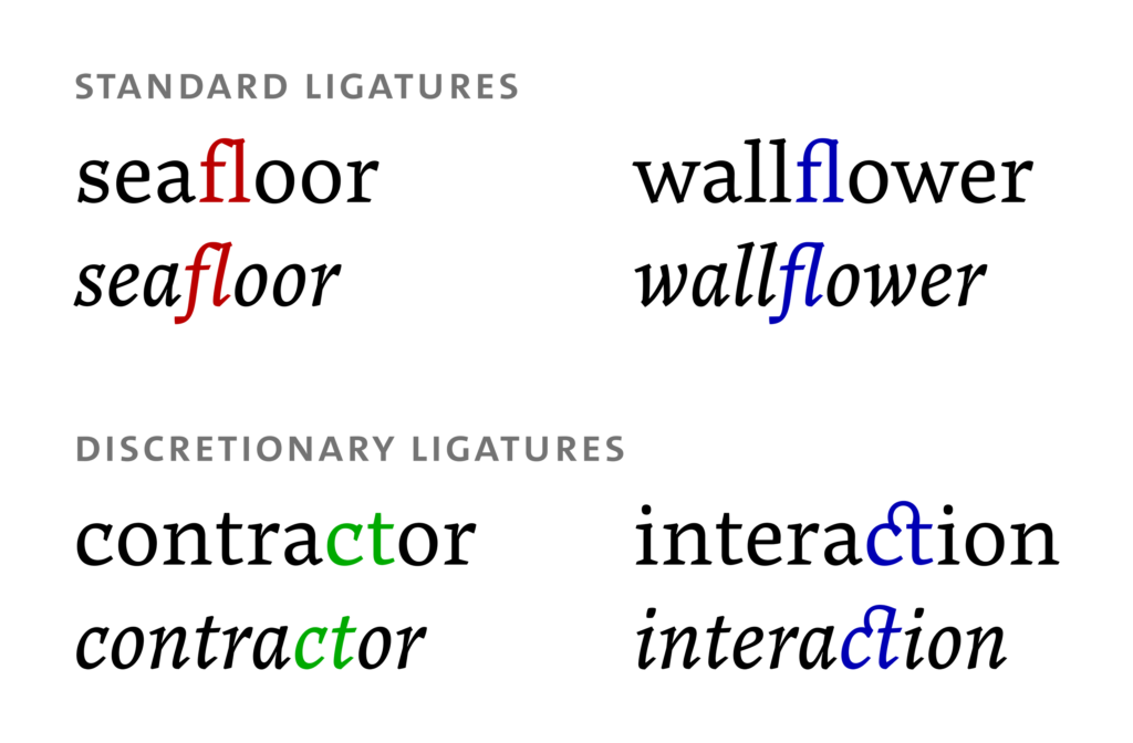
Hier die Liste der Ligaturen und auf‌fälligen kontextbasierten Varianten von oben nach unten:

Weiterlesen

Elective listening: the Get Vocal, Europe! playlist by Spotify

On the occasion of the 2019 elections to the European Parliament (23–26 May), Spotify published a playlist called Get Vocal, Europe! and alerted users in EU member countries of its existence. But this is not a first: Election-themed playlists have been published before by Spotify. The earliest example I was able to find are the November 2018 midterm elections in the US on the occasion of which playlists were published with songs that were “uniquely popular” in individual states around that time.

The Get Vocal, Europe! playlist takes a different approach: There are no separate playlists for individual countries. Rather, there is one playlist that features one song by an artist from each of the 28 countries that are currently members of the European Union. Transnational elections seem particularly apt for such an approach. Despite services like Spotify, music tends to have a hard time crossing borders – even within the European Union. And whenever there is a language barrier, the likelihood of a song becoming popular in another country is close to zero. The Get Vocal, Europe! playlist won’t change that, but it is a welcome opportunity to eavesdrop on the music taste of the neighbours for once.

But what is on the Get Vocal, Europe! playlist? Outside Spotify, I have not been able to find a full list of the featured artists and songs. Even within Spotify, there is no information with respect to the countries the artists are supposed to represent. The table below gives this information and adds the duration of the songs as well as the language they use (in the ISO 639-1 format). Links in the artist column point to Wikipedia articles in English (wherever available) or local languages. Links in the title column point to lyrics websites (mostly Genius). Additions and corrections are welcome. Enjoy – and get vocal!

Weiterlesen

Decoding Dodpo Momaubatg: A very welcoming mess-up

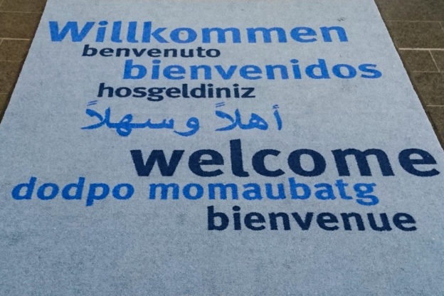
I recently passed through the entrance hall of a public building (which shall not be named). As in the entrance halls of many public buildings, there was a welcome carpet. Welcome carpets tend to be large, but ‘Welcome’ is a short word, so at some time, the makers of welcome carpets came up with the idea of translating the word ‘Welcome’ to other languages and putting these translations on the carpet as well. When you know the location of a carpet, you can predict the selection of translations quite accurately. In Germany, there will be few carpets that feature no English or French translation alongside the Ger­man word. Foreign languages that are widely taught (such as Italian or Spanish) and native languages of large immigrant groups (such as Turkish or Arabic) are also often encountered on these carpets.

Going by this, the carpet I saw was a fairly typical one. It had German (obviously), English and French, Italian and Spanish, Turkish (with a minor spelling mistake) and Arabic, and – eh, what is that?

‘Dodpo momaubatg’ did not look like a phrase from any of the languages I speak. The ‘-tg’ ending of the second word seemed to give it a Catalan tinge (but I knew that the Catalan word for ‘welcome’ is ‘benvinguts’). As a whole, the phrase was not recognisably related to any of the terms for ‘welcome’ I was aware of. I did a quick online search, but it did not turn up anything relevant, so I forgot about it and only showed the picture to a friend a few days later. She could not identify the language either, but said that the look of the phrase reminded her of Russian or another language written with the Cyrillic alphabet. To readers like her who only know the Latin alphabet well, Cyrillic letters look vaguely familiar, but you don’t know which sounds they represent and the combination does not make any sense.

The Russian phrase for ‘welcome’ is Добро пожаловать (Dobro požalovat’), but the connection with the phrase on the carpet is not immediately evident. One of my first thoughts was that this might be an example of encoding gone awry – but once you think it through, it does not hold up. First, the number of letters in ‘Dodpo momaubatg’ and the original Russian phrase is not identical (the original phrase has an additional letter in the second word). Second, the first and third letters of both words are different in Russian, but identical on the carpet. Even in a scenario with incorrect encoding or decoding, you would expect different (albeit unexpected) characters in the output for different letters in the input. So what happened instead? To be honest, I am still not entirely sure, but here is my best guess:

Weiterlesen
A short paragraph, typeset in Input Sans, a proportionally spaced typeface by David Jonathan Ross

Same look, less pain:
Proportionally spaced typefaces with a monospaced appearance

106 people pressed and 18 people found it worth a retweet when Ivo Gabrowitsch wrote: “If I had one wish, I’d wish for less ‘inspired by’ and more ‘solves this problem’ typefaces.” It is hard to disagree with what he says – but it is also hard to disagree with Ksenya Samarskaya’s reply: “Best ones do both, no?” This post is about what I consider to be a successful example of doing both.

Many designers are in love with the aesthetic of monospaced typefaces (i.e., typefaces in which each character occupies the same amount of horizontal space, as opposed to proportionally spaced typefaces in which character widths are independent of one another). The appeal of these typefaces may stem from some kind of nostalgic association with typewriters or from their use in technical environments (computer terminals, programming etc.). Maybe it’s both. In any case, the fascination is there. As a consequence, monospaced (or fixed-width) typefaces are used everywhere – not least in contexts in which their defining feature (fixed spacing) is irrelevant. But this feature keeps on having an impact, mainly on the experience of the reader. In monospaced typefaces, glyphs have to be wider or narrower than in typefaces without the fixed-width constraint in order to fit everything in the space that is available while keeping the spacing optically balanced. The result is not what most designers would like to set a novel in and it’s not what most readers would like to read a novel in. Actually, anything beyond a short stretch of text is a pain to read in a monospaced typeface, however nice things may look at first blush.
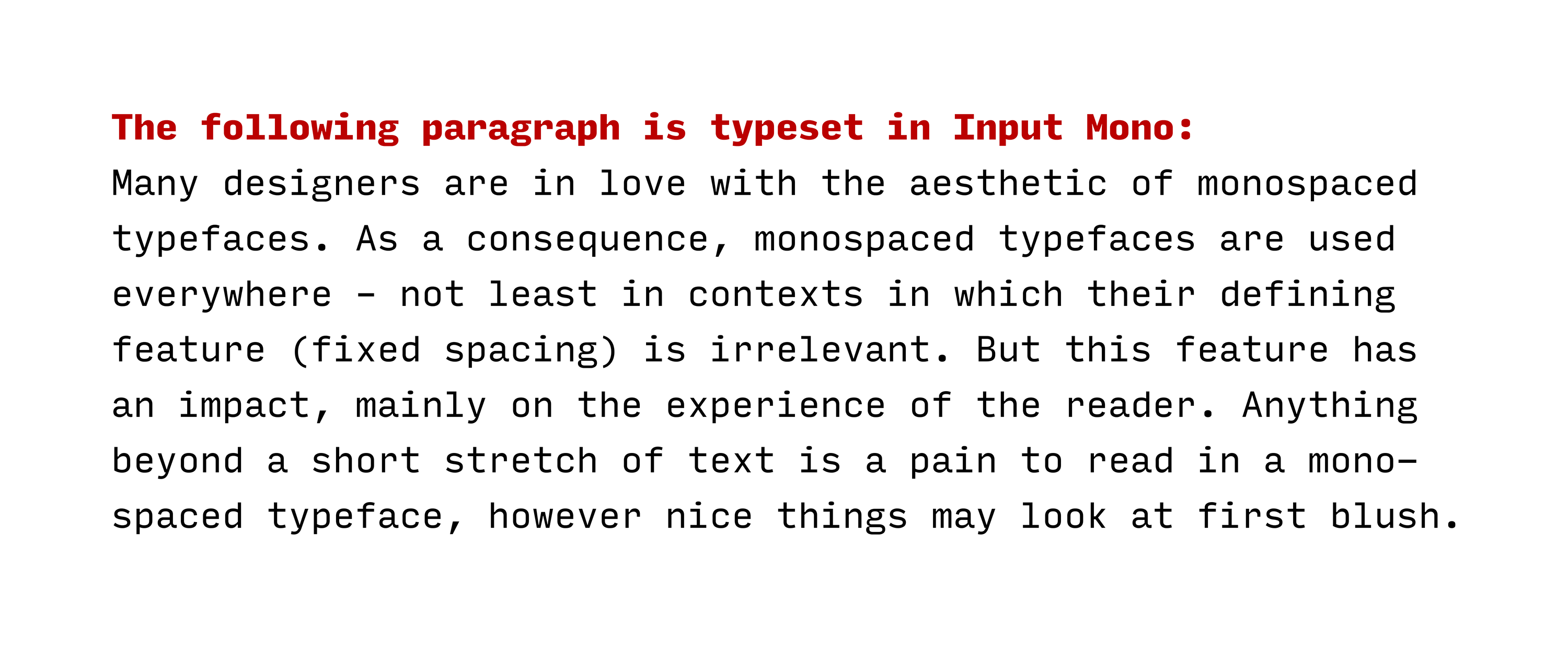
A short paragraph, typeset in Input Mono, a monospaced typeface by David Jonathan Ross

Type designers have found a solution to this problem. It’s not a new solution, but it is a solution that I think deserves more attention (hence this post). Type designers have created typefaces that look like monospaced typefaces, but actually use proportional spacing. The benefit: Designers get to keep the look they love, but readers don’t have to go through the pain of a true mono. Such typefaces – some call them ‘monofaked’ or ‘fauxnospaced’ – are easier on the eyes than the ‘real thing’. It is a balancing act for type designers to keep enough elements of typical typewriter fonts in order to avoid losing the appearance, while at the same time making substantial improvements to reading ease.
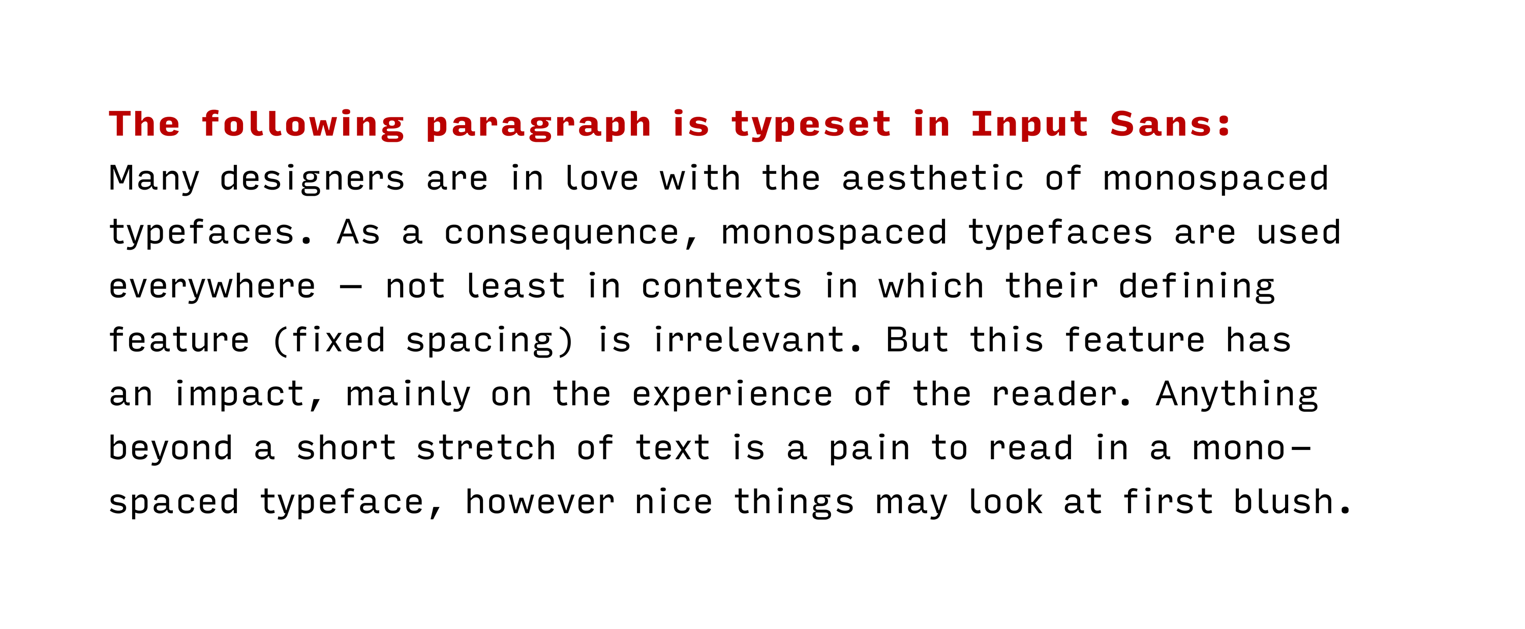
A short paragraph, typeset in Input Sans, a proportionally spaced typeface by David Jonathan Ross

The first typeface that fits this description was apparently one called Bulletin Typewriter: Released in metal as a monospaced font, it became available with proportional spacing in phototype and transfer lettering formats. The earliest in-use example of the proportionally spaced Bulletin Typewriter I am aware of is from 1973. American Typewriter was released not much later. In the following list of other typefaces in this category, I will – as usual – apply a liberal interpretation of any relevant criteria: Any typeface that vaguely looks like a console or typewriter typeface (read more about this term in an article by María Ramos) has a ‘monospaced appearance’ in my book. For a change, the sorting will be chronological rather than alphabetical to emphasise developments in this genre.

Proportionally spaced typefaces with a monospaced appearance

  • 1973: Bulletin Typewriter by Morris Fuller Benton (Mecanorma)
    (The link refers to a digital version of the metal monospaced typeface, originally released in 1933 by ATF. A proportionally spaced version was only available in phototype and transfer lettering formats. It’s in the list mainly for reference.)
  • 1974: American Typewriter by Joel Kaden & Tony Stan (ITC)
  • 1989: Officina Sans & Serif by Erik Spiekermann & Just van Rossum (ITC)
  • 1996–98: Letter Gothic Text by Albert Pinggera (FontFont)
  • 1999: TypeStar by Steffen Sauerteig (FontFont)
  • 2000: Bs Monofaked by Mário Feliciano (Feliciano Type Foundry)
  • 2000: New Letter Gothic by Gayaneh Bagdasaryan (Paratype)
  • 2001: Courier Sans by James Goggin (Lineto)
  • 2007: Newsletter by Ingo Krepinsky (Die Typonauten)
  • 2008: Generika by Alexander Colby (Milieu Grotesque)
  • 2008: Lacrima Senza & Serif by Alexander Colby (Milieu Grotesque)
  • 2008–2010: Lekton by Luciano Perondi and students at ISIA Urbino (Google Fonts)
  • 2010: Typewriter by Henrik Kubel (A2-TYPE)
  • 2011: Hellschreiber Sans & Serif by Jörg Schmitt
  • 2011: Relative Faux by Stephen Gill & The Entente (Colophon Foundry)
  • 2011: Signika by Anna Giedryś (Google Fonts)
  • 2012: Anaheim by Vernon Adams (Google Fonts)
  • 2012: Executive by Gavillet & Rust (Optimo)
  • 2013: Documan by Martin Vácha (Displaay Type Foundry)
  • 2014: Input Sans & Serif by David Jonathan Ross (DJR)
  • 2014: Queue by Tal Leming (Typesupply)
  • 2014: Triplicate by Matthew Butterick
  • 2015: Clone by Lasko Dzurovski (Rosetta)
  • 2016: Millimetre by Jérémy Landes (Velvetyne Type Foundry)
  • 2016: Operator by Andy Clymer (Hoefler & Co.)
  • 2016: Proportional by George Triantafyllakos (Atypical)
  • 2017: Attribute Text by Viktor Nübel (FontFont)
  • 2017: Bitcount Prop by Petr van Blokland (TYPETR)
  • 2017: Comspot Tec by Nils Thomsen (TypeMates)
  • 2017: iA Writer Duospace (based on IBM Plex Mono by Mike Abbink & Bold Monday)
  • 2017: Ultraproxi by Ray Larabie (Typodermic Fonts)
  • 2018: Clincher Duo by Alexander Lubovenko (ParaType)
  • 2018: Covik Sans Mono by James Edmondson (OH no Type Co)
  • 2018: Drive Prop by Elliott Amblard & Jérémie Hornus (Black[Foundry])
  • 2018: Tuner by Simon Renaud (Production Type)
  • 2019: Recursive Sans by Stephen Nixon (Arrow Type)

This list started on Twitter. Thanks to Reed Reibstein, David Jonathan Ross, George Triantafyllakos, Daniel H., Dave Coleman, Anthony Masure, Martin Wenzel, Frank Adebiaye, Michael Piotrowski, Akira Yoshino, Eric Mellenbruch, Max Phillips as well as the people from Studio Het Mes, Fonts In Use and Displaay Type Foundry for suggesting typefaces. If you know of any additional typefaces that may qualify, please get in touch.
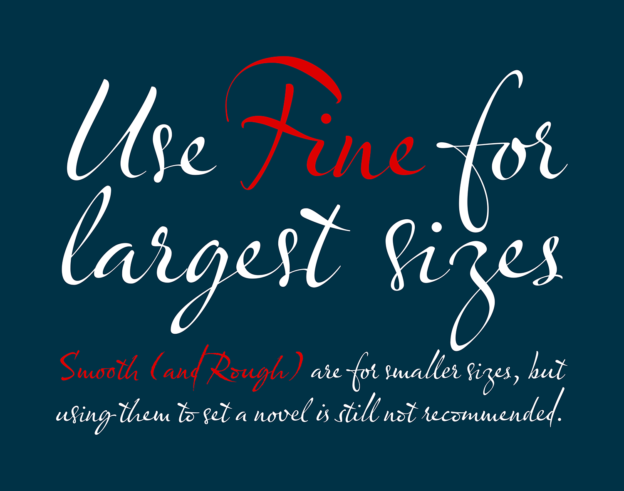
Olicana, a script typeface with optical sizes

Hands for all sizes:
Script typefaces with size-specific variants

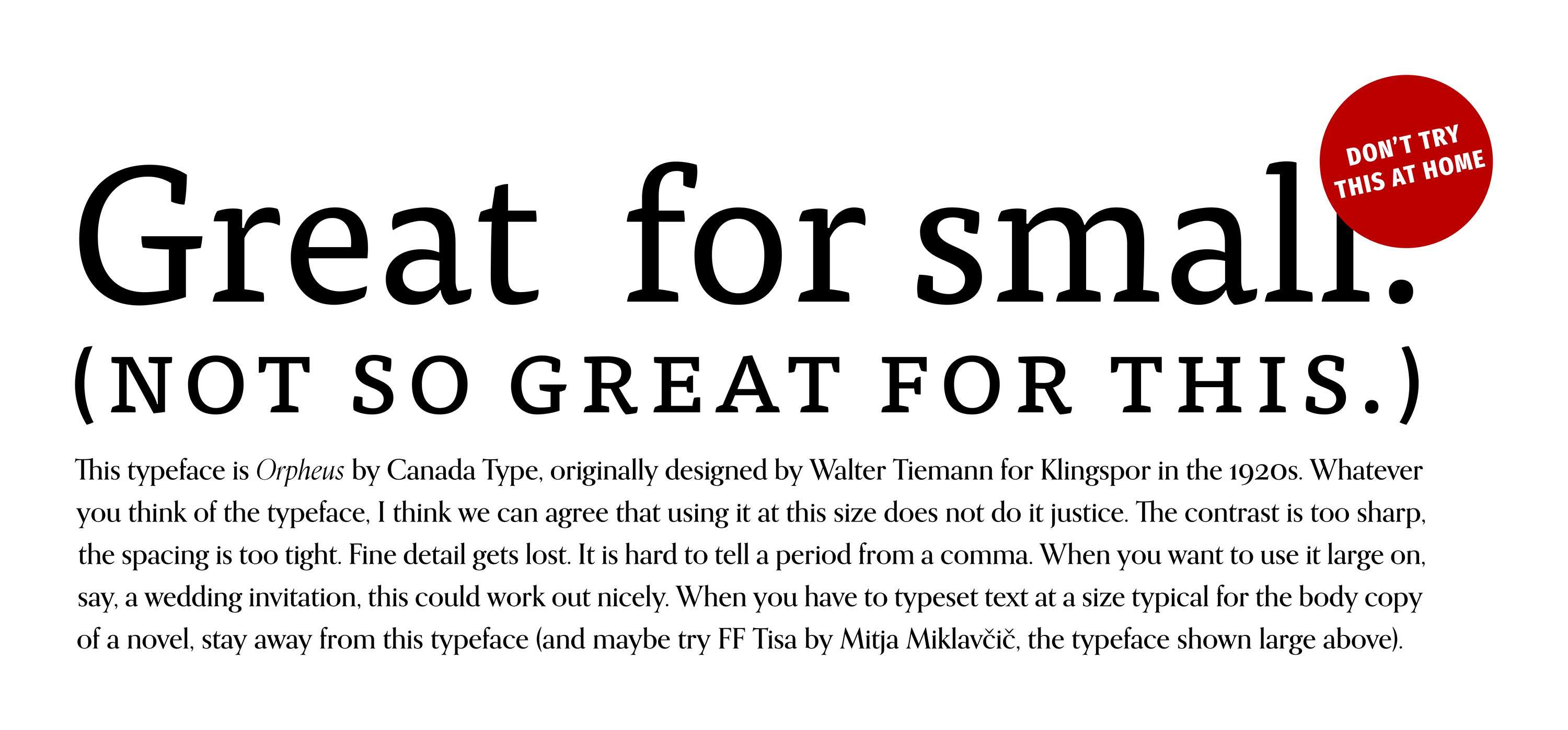
Size matters – at least in type. With digital type, we can use any font at whatever size we desire. But more often than not, we should not. Typefaces that work well at a certain size usually do not work equally well at other sizes. A typeface with pronounced contrast, sharp details and tight spacing that looks great on a billboard will fail at typical body copy sizes. Conversely, a typeface with coarser details and sturdier proportions, optimised for small sizes, is likely to look clunky when set large.
FF Tisa and Orpheus
But what if you would like to use the same typeface for headings and text? In that case, you may want to consider a typeface with ‘optical sizes’ (i.e., variants with size-specific adjustments). Many such typefaces exist (Identifont has an alphabetical list). Tim Ahrens and Shoko Mugikura have written about some of them and provide a list of all typefaces covered in their book on their website. Browsing through these lists, I noticed that few are script typefaces (i.e., typefaces based on calligraphy or other types of handwriting). That surprised me, given that handwriting is also markedly size-specific. The release of a new typeface in that category was the reason for me to compile the following list:

Weiterlesen

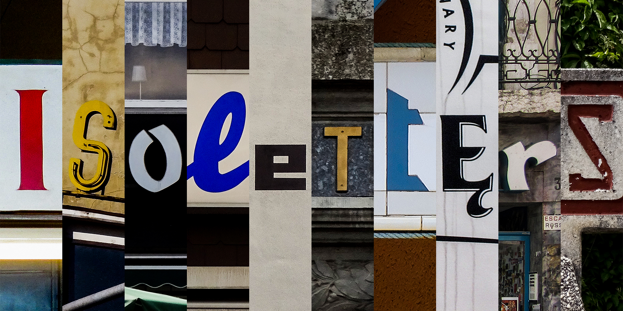
Welcome to @isoletters

On 1 January 2018, I will start sharing pictures of letters on a new Twitter account: @isoletters. I have been taking letter pics for years and occasionally shared them, for example on my @‌isoglosse Twitter account (which I will continue to use for anything except letter pics) or on Flickr. Browsing through my collection, I decided that I would like to share pictures from it more regularly. A collection is not worth much when nobody looks at the items and maybe gets inspired by them. For that reason, I will try to post one picture on each day of 2018. You are welcome to follow. I also hope that you will comment, correct me if I am wrong and share your own pictures. What kind of pictures can you expect?
Isoletters
All pictures I will share on @isoletters are of some typographic interest (or at least I think so). Given my own background, I may also slip in some pictures that are interesting from a linguistic perspective. When trying to classify the pictures I collected, one may end up with roughly the following categories:

Weiterlesen

Old type in new fonts? First impressions of Fontstore

A few days ago, Font­store launched – a new player in the market for subscription-based font services. To be accurate, Font­store is both a foundry and a font service provider: You can buy fonts there like at any other foundry, but you can also become a subscriber. For $ 15 per month (or $ 150 per year), you get access to their entire library of desktop fonts. Having used Typekit for a few years and having reviewed the Monotype Library Subscription (MLS) last year, I was curious to see what Font­store has to offer. The very first impression was not too favourable: Their website is slow and cluttered up with animations and effects, making it difficult to get an overview of their collection (others loved their site or also hated it). Font­store does not excel at transparency either: The name of its founder, Satya Rajpurohit, is nowhere to be found on the website (though he has promised to remedy this). In order to access the Font­store Library (the contents of which will be discussed below) through the subscription service, I subscribed and payed by credit card; both went without problems. Installing the app syncing the fonts on Windows was not exactly a seamless experience, though: I got a number of warnings that are typically not shown upon installing software, but just going ahead did not crash the system. Once installed, you go to the website, select the fonts you want to use, and they are available just seconds later.

Slim pickings for type designers

As I noted in my review of the MLS, low-priced font subscription services do not only raise technical questions, but ethical ones as well. Creating fonts is a time-consuming task requiring specialised skills that are gained through extensive training and practice. Few type designers create fonts just for the fun of it. Most do so to make (part of) a living – but you need a lot of subscribers before you are able to provide decent payment to all type designers. As a customer, you have to decide: Is subscribing to such a service tantamount to supporting exploitative working conditions and fuelling the downward price spiral in the font market? In the case of Font­store, the decision may be a little easier: All typefaces were commissioned for that service with (I presume) designers knowing what they signed for. In a post on TypeDrawers, Satya Rajpurohit, the founder of Font­store, explained that Font­store offers different payment models to type designers, neither of them based on royalties. In any case, the business risk mainly rests with Font­store, rather than with individual designers. That seems friendlier than royalty-based models, but $ 15 per month is still not much to go round, so time will tell if the system is sustainable. Also, even the best offer in a given situation can be a bad one: Font­store carries fonts from quite a few young type designers, some of them releasing their first retail fonts. Many senior designers may have been reluctant to accept Font­store’s payment models and have their fonts offered at a bargain price.

Weiterlesen