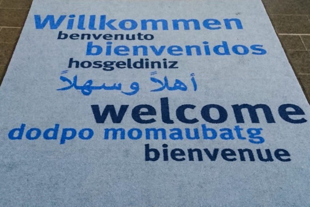
I recently passed through the entrance hall of a public building (which shall not be named). As in the entrance halls of many public buildings, there was a welcome carpet. Welcome carpets tend to be large, but ‘Welcome’ is a short word, so at some time, the makers of welcome carpets came up with the idea of translating the word ‘Welcome’ to other languages and putting these translations on the carpet as well. When you know the location of a carpet, you can predict the selection of translations quite accurately. In Germany, there will be few carpets that feature no English or French translation alongside the German word. Foreign languages that are widely taught (such as Italian or Spanish) and native languages of large immigrant groups (such as Turkish or Arabic) are also often encountered on these carpets.
Going by this, the carpet I saw was a fairly typical one. It had German (obviously), English and French, Italian and Spanish, Turkish (with a minor spelling mistake) and Arabic, and – eh, what is that?

‘Dodpo momaubatg’ did not look like a phrase from any of the languages I speak. The ‘-tg’ ending of the second word seemed to give it a Catalan tinge (but I knew that the Catalan word for ‘welcome’ is ‘benvinguts’). As a whole, the phrase was not recognisably related to any of the terms for ‘welcome’ I was aware of. I did a quick online search, but it did not turn up anything relevant, so I forgot about it and only showed the picture to a friend a few days later. She could not identify the language either, but said that the look of the phrase reminded her of Russian or another language written with the Cyrillic alphabet. To readers like her who only know the Latin alphabet well, Cyrillic letters look vaguely familiar, but you don’t know which sounds they represent and the combination does not make any sense.
The Russian phrase for ‘welcome’ is Добро пожаловать (Dobro požalovat’), but the connection with the phrase on the carpet is not immediately evident. One of my first thoughts was that this might be an example of encoding gone awry – but once you think it through, it does not hold up. First, the number of letters in ‘Dodpo momaubatg’ and the original Russian phrase is not identical (the original phrase has an additional letter in the second word). Second, the first and third letters of both words are different in Russian, but identical on the carpet. Even in a scenario with incorrect encoding or decoding, you would expect different (albeit unexpected) characters in the output for different letters in the input. So what happened instead? To be honest, I am still not entirely sure, but here is my best guess:
‘Dodpo momaubatg’ looks as if someone unfamiliar with the Cyrillic alphabet tried to render the Russian phrase using Latin letters, maybe even unaware that they were dealing with Cyrillic. You will see that it is likely that the whole thing started with a handwritten version of the phrase.
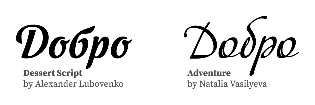
Let’s go through it letter by letter: The first word is fairly straightforward. In cursive, ‘Д’ is similar to handwritten Latin ‘D’ (the lowercase differs, so the handwritten version probably had an initial capital and the transcription was changed to all-lowercase later). There are no major glyph differences between Cyrillic ‘о’ and Latin ‘o’ or Cyrillic ‘р’ and Latin ‘p’. (These are different letters, of course, that represent different sounds, but this is irrelevant here.) The only surprising letter in the first word is the second ‘d’, but it is less surprising when you look at Russian handwriting or typefaces in a handwritten style. Here is a comparison of two typefaces that show possible glyph shapes: In the left-hand example (Dessert Script by Alexander Lubovenko), ‘б’ is shaped similarly to the figure ‘6’, but in the right-hand typeface (Adventure by Natalia Vasilyeva), it has a shape more like Latin ‘d’, so there you have it: ‘Dodpo’.
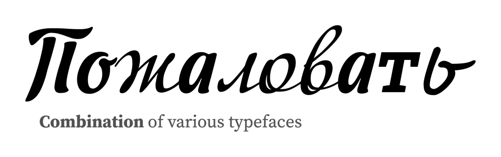
The second word again seems to have started with a capital letter in the version that the transcription was based on. Lowercase ‘п’ is not really similar to Latin ‘m’ (rather to Latin ‘n’), but the uppercase version resembles the way some people write Latin ‘M’: two vertical lines with a wavy horizontal line on top. You would not expect Cyrillic ‘ж’ to look like any Latin letter, but it is really quite similar to Latin ‘m’ (see below). Just like ‘o’, ‘a’ looks the same across scripts. The reason for the divergent number of letters between the Russian phrase and the one on the carpet lies in the next two letters: Cursive Russian ‘л’ looks similar to Latin ‘i’ (without the dot) and seems to have been conflated with the following ‘o’ into Latin ‘u’. Cyrillic ‘в’ often has an ascender and can look like cursive Latin ‘b’. The letters that are most mysterious to me are the two final ones in the second word: For Latin readers, ‘т’ is one of the false friends Cyrillic cursive has in store. I have rarely seen cursive handwriting or a typeface in a cursive style in which it did not look the same as Latin ‘m’, so I am surprised that the carpet does not read ‘-bamg’. It’s only a hunch, but the writer of the Russian phrase might have been aware that cursive ‘т’ is potentially confusing for Latin readers and have avoided the characteristic cursive shape in favour of a shape more similar to printed upright letters. The last letter, Cyrillic ‘ь’, does not look a lot like Latin ‘g’ to me, maybe a bit like a sloppy small-caps version of uppercase ‘G’ (but why would you end a word with an uppercase letter?). We can only assume that the person who made the ‘transcription’ did not ask too many questions and just went ahead with what came to their mind first.
Here is a rendering of what the second word of the phrase – ‘Momaubatg’ – may have looked like to its transcriber (please ignore the fact that it was pieced together from various typefaces).
At this point I think we can safely conclude that ‘Dodpo momaubatg’ is a poor Latin rendering of Добро пожаловать, the Russian equivalent of ‘Welcome’, and that the transcription could hardly have gone worse. Any additional speculations about the process that led to this result are highly welcome.
I was tempted to call the PR department of the institution where I took the picture to find out if the mistake was eventually discovered. In particular, I would have loved to learn if the person who had provided them with the Russian translation ever saw the result. Then again, chances are that no one ever noticed and they were happy with the result and just put the carpet in the hall. Chances are that they would have been unable to answer my questions and that no one would have been any happier or wiser after this call, so I did not make it. But for you, dear reader, the take-home message is clear: If you ever want to have letters printed on a carpet, be careful – or Ocmopomno, as we say in Russian.
At least we can safely say that the typeface for the Latin characters is FF Meta, in it Bold weight. There is a Cyrillic version of Meta as well which would have been the one to use rather than a bad transcription.
Pingback: weekend reading 5 | enjoying the postapocalypse
Pingback: Februar retrospektiv // °185 – e Büttche Bunt
I would’ve paid money to see the reactions had you made that call…
I was asking myself what language that might be today as I was in a building with that carpet. thanks for your efforts