MLS. That’s not the name of a tropical disease or some obscure government agency. The abbreviation stands for Monotype Library Subscription. Launched a few days ago, MLS is a subscription-based service that gives members access to “more than 9,000 fonts (2,200 font families)” (Monotype says). The price tag is at no more than €/$ 14.99 per month (or €/$ 119.99 per year). The fonts can be used in desktop applications, but – unlike the fonts on Typekit, a competing service by Adobe – not on websites.
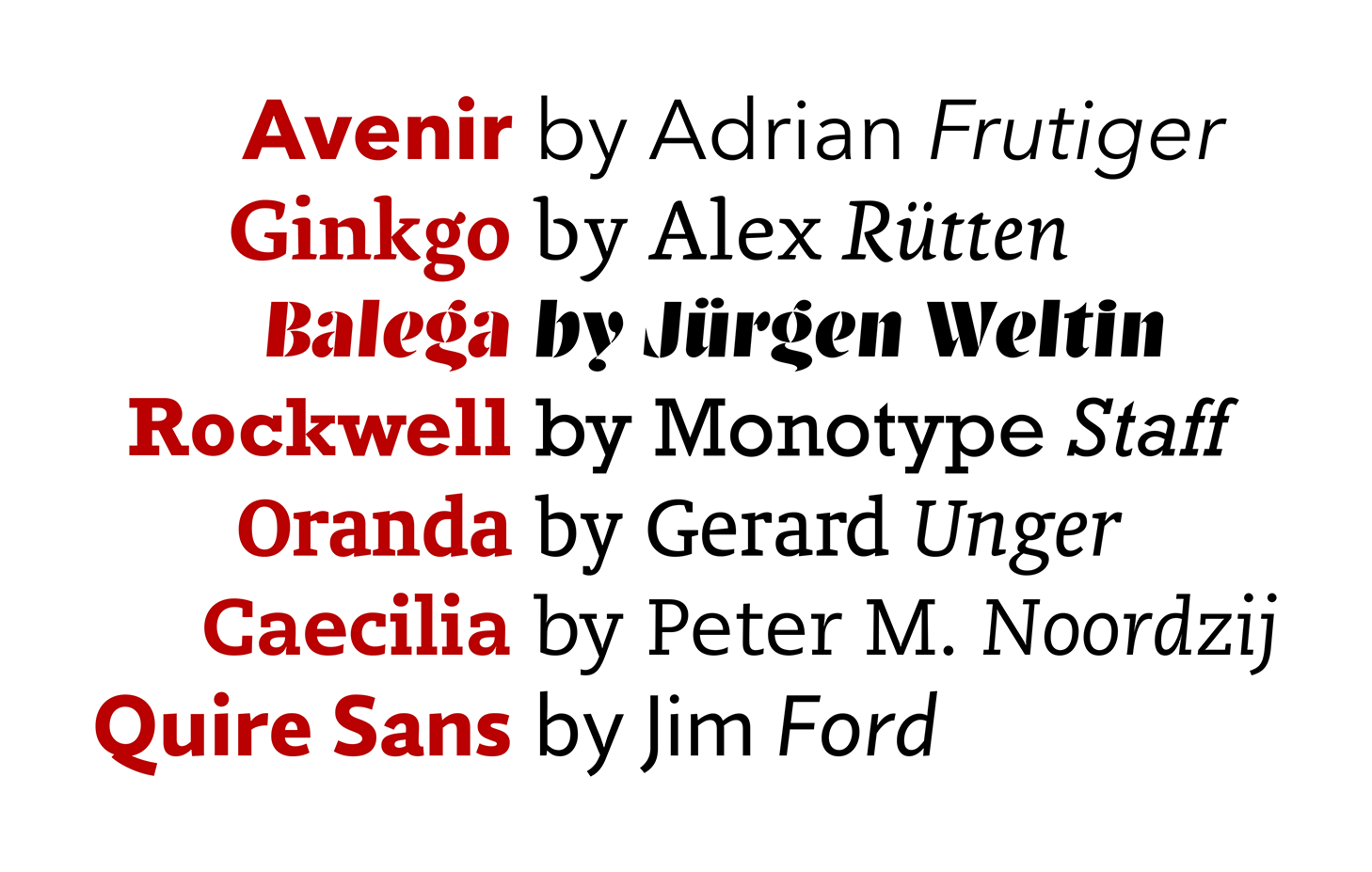
For graphic designers, this sounds like a good deal. €/$ 14.99 per month for high-quality typefaces is next to nothing. A regular licence of most typeface families available through the MLS would cost twenty times as much or more. The choice seems ample: The library, Monotype says, features “reliable workhorses” (such as Avenir Next), “unique choices” (such as Ginkgo, Linotype’s take on the Dolly genre) and “attention grabbing” typefaces (such as Balega). Let’s be clear, though, that most of what you get is hardly at the cutting edge of contemporary type design. Innovation happens elsewhere. This may be a deal breaker for all those who are trying to produce fresh or even innovative work. In that industry, Rockwell (released in 1934 and based on earlier models) probably won’t count as ‘attention grabbing’ any more and Oranda (from the mid-80s) does not qualify as ‘unique’. That may be less of a concern for those interested in subdued text typography: MLS includes a number of modern classics that have aged with grace and can still be used nicely (such as Caecilia), along with some good recent releases (such as Quire Sans). It helps, by the way, if you only need to use Latin-based alphabets: For those, the language support of most typefaces is good. For Greek, Cyrillic or Arabic, not so much.
Here are samples of the typefaces I have mentioned in the last paragraph. I have not included Dolly from Underware because it is not part of the MLS (but it is nice, as you probably already knew).
For type designers, by contrast, the deal is much less appealing. Everyone who is remotely familiar with type design knows that a typeface family is not finished in one day. At the end of that day, not even one weight will be finished in most cases. Many type designers can easily spend one day on shaping one single letter. And most type designers have not gotten rich in doing so. Even before MLS launched, this had something to do with royalty rates, in other words: How much of the price of each licence of a font family ends up on the designer’s bank account? This ranges from 100% – for fonts bought directly from the designer – to as low as 40%, depending on the reseller.¹ 40% of €/$ 300 is €/$ 120. Not that much for something you worked on for a couple of months.² In the last few years, some designers have tried to increase their income by giving steep discounts of 90% and more, hoping that a higher number of customers would compensate for the lower amount each customer pays. In some extreme cases, entire typeface families were sold for a tenner. 40% of €/$ 10 is €/$ 4, which does not even buy you decent lunch in some parts of the world. Quite understandably, this has been criticised as a race to the bottom. With the introduction of the MLS, some argue, the market has hit rock bottom. How much can there be left for each individual type designer when customers only pay €/$ 14.99 for accessing more than 9,000 fonts? That is a legitimate question to ask, even if you expect a large number of customers to subscribe to a service like MLS. And it is not only on business grounds that objections have been raised against the MLS: Many type designers have spent quite some time explaining to (potential) customers that typefaces sold at lowest prices – think: discs with 5,555 fonts from the bargain bin – are typically semi-legal crap and best avoided. “More than 9,000 fonts for 14.99”, as the MLS offers, seems too close for comfort to the bargain bin. Selling rather good type at that price is seen as a symbol of the devaluation of type design as a whole. Also, it has been suggested that the immediate and effortless availability of that many typefaces may lead to feelings of satiety and indifference on the part of the customer.
So, what do things look like in the bargain bin? What do you get for €/$ 14.99? I was curious to see what the MLS exactly offered, subscribed to it and tried it out. Here are some of my first impressions:
I subscribed through MyFonts because I already had an account there, but Fonts.com would have been possible as well. Interestingly, the MLS was rather hard to find on MyFonts: It is not featured on the home page and did not seem to be advertised in any other prominent spot. (MyFonts is the first result, though, when you google ‘Monotype Library Subscription’ and the MLS is mentioned on the family page of fonts that are included.) After buying the subscription, I was asked to download the free SkyFonts software, which is used to synchronise the fonts. It is somewhat similar to the Creative Cloud application that is used for synchronising fonts from Adobe’s Typekit. As soon as you have SkyFonts installed, you can click on the ‘Install’ button on the MyFonts page of any of the available font families, which will be installed then. Or not. I tried to install a font family on Windows 10 from the latest version of Firefox with NoScript activated, a widely used browser extension for blocking executable content. A window appeared, saying “We’re checking for SkyFonts … This should only take a few seconds.” Nothing happened, even after I had whitelisted all sites that seemed relevant for the font installation. Entirely deactivating the extension did the trick. This is handled much better in Typekit, which I have used before and which never seemed to be bothered about NoScript. As I did not want to change my browser configuration for using the MLS, all remaining testing was done in Chrome with no extensions installed.
Using Chrome, I was able to install two families within not even a minute. Then I sat there with Word and InDesign open, waiting for the typefaces to appear in the font menu. Nothing happened. After a few minutes, I got out of patience, restarted the applications – and there they were, both typefaces. When I was just about to write that all this seemed rather impractical, I tried again with a different font family. It appeared in the font menu within seconds with all applications still open. Another time I tried, I had to wait for a couple of minutes again or even restart the application I wanted to use the font in. There seemed to be no relationship with family size: Sometimes a single-style font kept me waiting for four or five minutes, sometimes a family with multiple weights and styles appeared immediately. In most cases, it helped to select ‘Sync fonts’ in the SkyFonts app, triggering a resynchronisation of all fonts. Compared to Typekit, used on the same machine, this seems rather inconsistent, which may disappoint some users. (But then again, what can you expect for €/$ 14.99, huh?) Once a font is installed, it makes no tangible difference whether it was installed manually, through Typekit or through SkyFonts – except that in the last two cases, it will be gone once you stop using the service in question.
At that point, I wanted to see the full range of typeface options the MLS gave me. “See all the fonts”, the main page of the service on MyFonts said and directed me to a page with the word ‘browse’ in the URL. One thing I could not do there was browse the entire library of purportedly more than 2,000 typeface families. The page showed a selection of maybe 50 typefaces (sorted by “relevance”, it said). At the bottom of the page, I could click on a blue bar to “load the next 50 of 2160 remaining results”. Nothing happened. I saw that I could also search the library using keywords or advanced search. I tried ‘Any field contains “Serif”’ as a simple query and got 494 results. Well, in fact, it said there were 494 results, but I was only shown five (again sorted by relevance). Entering ‘Serif’ in a different search field also yielded 494 results, of which I now was shown 50. There seemed to be no way of accessing the remaining 444 results. As an alternative, I tried sorting the results by publication date, rather than relevance. This did not work either. Instead, my search term was discarded and I was shown a list of the most recent typefaces in the entire library. I was surprised to see the sophisticated (and good) MyFonts search perform so poorly here. I was surprised, too, that there was no simple way to add ‘Included in the MLS’ to any query. (If there is, I have obviously not found it.) On Fonts.com, I eventually found a list of what seem to be all 2,220 typeface families, which kept lazily loading for ages. Technically, one may say that you can browse the entire library there, but I would not say that you get a good overview. I swear that Adobe did not pay me for saying that Typekit handles this slightly better: In their library search, you can easily filter by style, language support, domain of application, availability for desktop use etc.
Summing up, I think we can conclude that the introduction of the MLS raises questions of usefulness and ethics: Does the library, as huge as it seems, include anything you may want? You will have to decide that for yourself. Given the low monthly rate, can there be fair payment for type designers and does the price set a good standard for the industry as a whole? I am sceptical, but again: That’s a call you have to make for yourself. The least controversial point certainly concerns the way the library is implemented on MyFonts and in SkyFonts: It could be worse, but it’s far from impressive right now.
Footnotes
1 Type designers – including Kai Bernau and Dan Reynolds – have made me aware of the fact that a royalty rate of 40% is not even that low. My source for this figure was this 2008 article by Stephen Coles, citing royalty rates of 40–65% that type designers get from a reseller like MyFonts. I omitted that the article also cites royalty rates of 20–50% that are paid to type designers who sign with a foundry. It has been claimed that even before the introduction of the MLS, the low end of this range applied to many designers of typefaces sold through Monotype or its subsidiaries. 20% of (the price of a heavily discounted typeface family that sells for) €/$ 10 is €/$ 2, which does not buy you lunch in even more parts of the world. Keep that in mind. David Březina has rightly pointed out another omission: I said above that type designers who directly sell licences of their typefaces get to keep 100% of the sales price. This is true, but these type designers will have to use some share of their revenue to cover expenses for administration, website and shop development, promotion, customer support etc. When fonts are sold through a foundry or a reseller, some or even most of this will be done by someone else (which is one of the reasons why foundries and resellers keep a part of the sales price). Obviously, type designers also have to pay taxes in most jurisdictions – but this has nothing to do with the royalty rates they get. ↑
2 If you are not a type designer, read this again: “€/$ 120 are not that much for something you worked on for a couple of months.” This is neither an exaggeration nor an exception. Rome was not built in a day and Trajan was not drawn in a day – and not in a week or a month either. Type design is an activity that, done well, is much more time-consuming than most type users would think. Maybe quite appropriately, it was Monotype that set up a PR stunt called ‘Font Marathon’ in 2015, demonstrating that experienced type designers can produce usable type in just a few days. However, these are extremely atypical circumstances. The real marathon, many type designers commented back then, are the months or even years of work that go into planning, drawing and programming a full-fledged typeface family. ↑
Good article. I actually feel like they’re leaving a bit of money on the table here at the price, which is why I feel professional type designers have a right to be cross. I mean, I’m not a professional graphic designer, just someone who uses quite a lot of fonts (which I’ve paid for) for personal projects, and I’m tempted. They could charge four or five times as much and still have a bit of take-up. (Though there actually was a programme like this on fonts.com, which was hideously expensive-if anybody used it I certainly never heard of it.) Goodness only knows what people would pay for a H&FJ or Font Bureau subscription deal.
It’s clear their goal is to expand the market of font buyers, though. Let’s face it: the target market of this is probably people who otherwise would have pirated, next-best-thing-to-pirated (I’m not going to name the vendors I’m thinking of here, but I’m sure you can guess them) or kept using Minion and that CD they bought in 1998. This isn’t a plan that will sell to the kind of people who otherwise would have shelled out for licenses to Guardian Egyptian Complete and Dala Prisma. In fact, they’ll probably now buy this too.
This has been the inevitable problem for foundries since the metal type era: with fads so prone to come and go, nobody likes to be left with a store of expensive metal type (or licenses to it) when fads change. Monotype recognised it in the 30s by renting matrices for fad fonts, I believe. And the thing about subscription plans is that often they are advantageous for tax or business planning purposes.
Thanks for your comment! Interesting thoughts.
You are certainly right that the MLS is aimed at different customers than the licence of an entire typeface family from a more up-market foundry is. Quite generally, there is not much to be said against expanding the market. It seems quite likely, however, that the number of users subscribing to the MLS is not going to compensate for the extreme discount that this subscription-based model effectively means, relative to regular licensing. Also, some professional designers who previously bought regular font licences will now take an MLS subscription, probably resulting in an effective loss of royalties on the part of the type designer. To avoid this effect, there would have to be a massive rush for this way of licensing fonts from people who have not spent any money (or hardly any) on fonts before. Time will tell who got the short end of the stick here.
Thank you so much for sharing your thoughts on our Fonts.com experience. We’re currently working on a new browse experience and hope that you will enjoy it when it comes out, but in the mean time, if you do perform a search (it can even be an empty one), we do have a filter for MLS. This is in no way defending our current ux, but just a little information so you can hopefully get more use out of your subscription. If you’d be interested in testing our browse feature at a later date, you are more than welcome to reach out to me!
Thanks for letting me know!
I hadn’t noticed this filter before (probably because I subscribed through MyFonts and only took a brief look at the Fonts.com website). However, you may want to check if the filter does what it is supposed to do: When searching for ‘Serif’, one of the results I get (with the MLS filter applied) is FF Meta Serif, which does not seem to be part of the library. Also, the sorting by ‘Date released’ does not work properly: When I select this option, ‘Arnold Boecklin’ is one of the first results, which does not seem right. I’m sure your customers would appreciate it if these problems were solved and if an MLS filter were available on any site where you can buy a subscription.
This is incredible. Such a lot of effort put into filters and search functions and UI interfaces. My advice: issue a simple, downloadable pdf specimen, that lists every font you’re selling, that people can read. Then people can make their own notes on what they care about. No futzing about with typing into a search interface, no list that must be 2000 fonts long if it is to offer perfect discoverability of the thing I didn’t know I wanted to use. Put a date on the specimen file if you expect things to change.
You are offering an amazing service for a price so cheap your competitors are amazed and appalled. I don’t understand how you can screw this up, but you are doing it.
“Then I sat there with Word and InDesign open, waiting for the typefaces to appear in the font menu. Nothing happened. After a few minutes, I got out of patience, restarted the applications – and there they were, both typefaces.”
By the by, for Office 2011 (the 2016 beta is too aweful to use so far) that’s usual behavior. It’s against the principles of OS X but, well…
Pingback: Old type in new fonts? First impressions of Fontstore | Isoglosse.