
When characters look similar to one another, misreadings or even misunderstandings may result. In such cases, type designers often try to avoid glyphs looking completely identical. One example of a similarity that can get too close for comfort is between the digit ‘0’ (henceforth: zero) and the letter ‘O’ (oh). Differentiation strategies between lining zero and upper-case oh have been shown to be fairly uniform across typefaces: Zero is almost always narrower and often less tall than Oh. These and other strategies have been discussed in a 2013 article by Charles Bigelow. He focuses on lining figures in typewriter typefaces and only briefly mentions contemporary approaches to non-lining zero and lower-case oh – a pair that is also prone to confusion and seems to be treated with less uniformity in recent typefaces. Inspired by a tweet by Shiva Nallaperumal, I have compiled typical and not so typical ways of distinguishing non-lining zero from lower-case oh. My observations are mainly based on old-style roman text typefaces in the Typekit library; this sample is not representative of anything but the Typekit library itself, which, however, contains a bunch of well-known, widely used typefaces.
No differentiation
One thing type designers can do is to design a glyph that will work both as a zero and as an oh. In the Typekit sample, one eighth of the typefaces has a (virtually) identical glyph for both characters. One may disagree on whether this is a cop-out (because you do not have to think about how to differentiate the glyphs) or a harder task in fact (because you have to design a glyph that works in two contexts). This variant certainly poses the risk that the non-lining figures end up looking small next to lower-case letters: When lower-case oh, the top of which (optically) aligns with the x-height, and zero are identical, all other numerals also have to use the x-height as a point of reference. In the examples below, the hanging figures indeed look a bit on the small side, but tolerably so.
Width and height
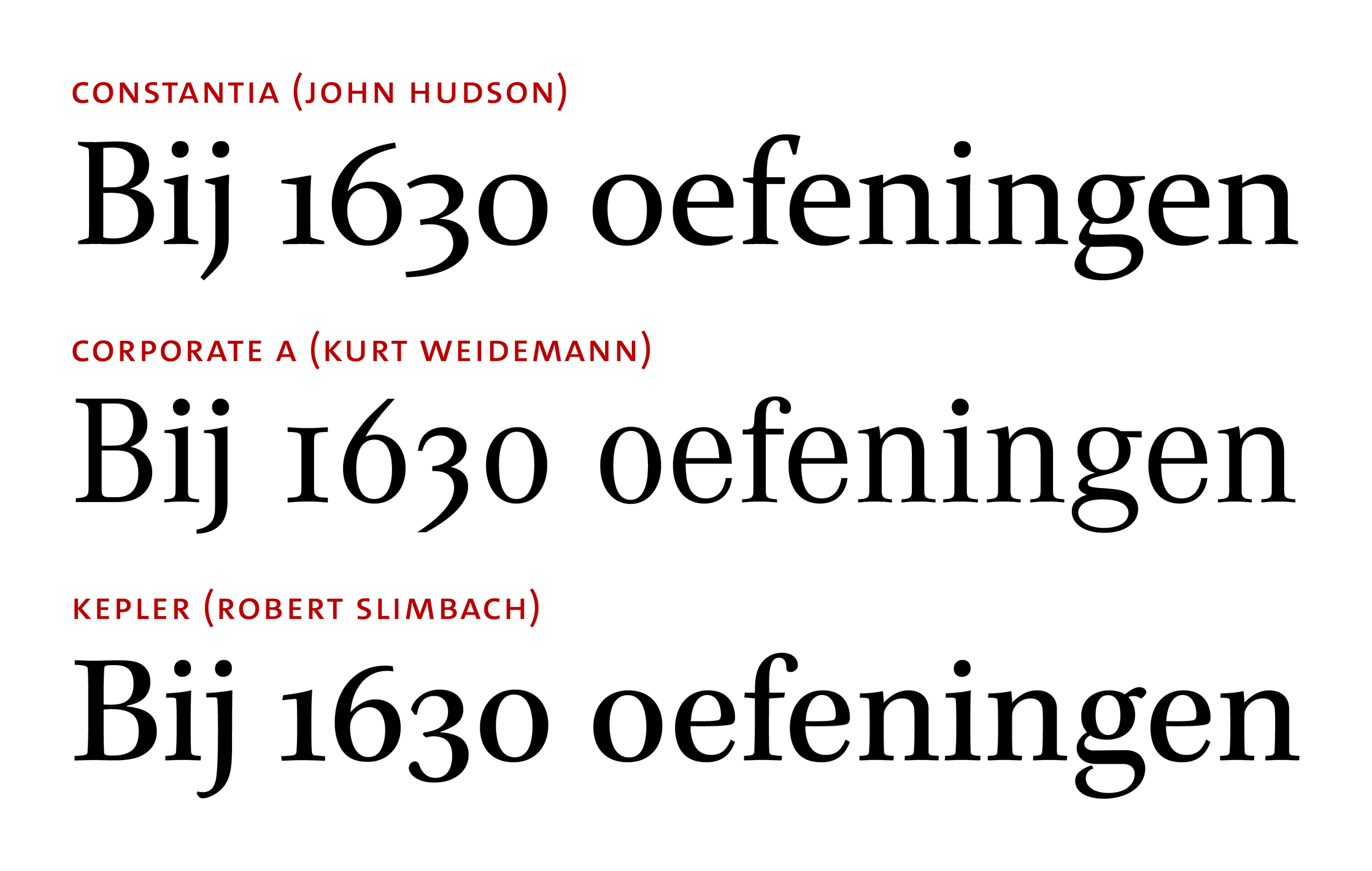
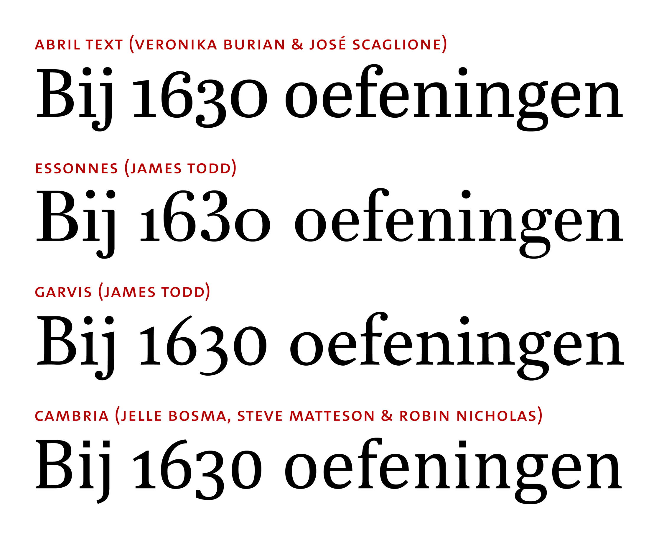
The variables that are used most frequently to distinguish between zero and oh are width and height. Only one fifth of the typefaces in the Typekit sample (excluding typefaces that have identical glyphs) do not manipulate either of the glyph dimensions. In many cases, zero is both wider and taller than oh. The examples below show that in the first row (Abril Text): Zero is basically an enlarged version of oh (with optical corrections applied). Width and height need not increase to the same extent. The zero glyph of Abril Text is only about 8 % taller than oh, but roughly 14 % wider. There are few typefaces in which zero is only wider, but not taller than oh: Essonnes is one example of that. As always, simply stretching the glyph does not do the trick, so optical corrections have to be made. The reverse case – taller, but not wider – is found more frequently. In Garvis, another typeface by James Todd, the zero glyph is not wider, but about 16 % taller than oh. Zero is almost never lower than oh, but it can be narrower. If it is, the height often does not vary a lot between the glyphs. Cambria, a ClearType font shown in the bottom row, is one of the rare cases in which zero is both narrower and taller than oh.
Slant of the axis of contrast
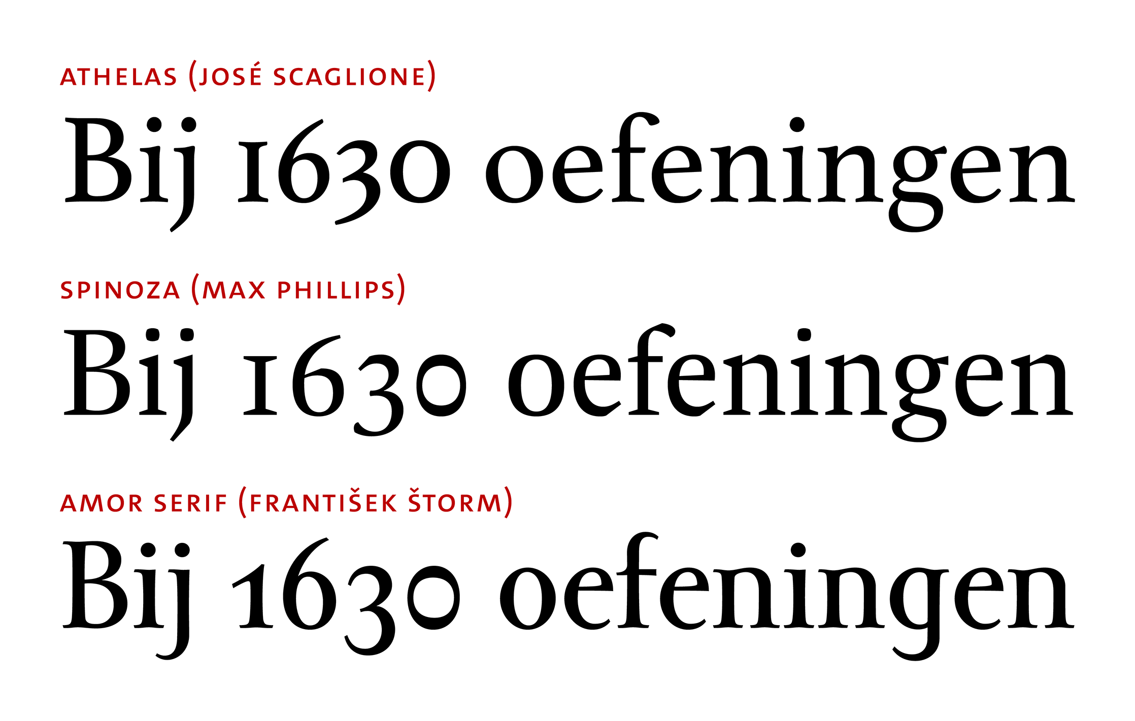
The focus of this overview is on old-style typefaces, so there is no way around talking about contrast or stress (i.e., alternation between thick and thin letter parts). Type designers have leveraged contrast in order to differentiate between zero and oh. One aspect of this is the stress angle (or axis of contrast), that is, an imaginary line that is most easily visualised by connecting the thinnest sections of a round letter (i.e., the parts of the letter that are not stressed by means of thickness). In many Antiqua (or old-style) typefaces, the axis is not vertical, but slightly slanted to the left. (Of course, in many other serif typefaces, the axis is vertical – read on here.) The letter oh typically has the same stress angle as all the other letters, but the digit zero may have a different one. This is clearly seen below: The axis of contrast in Athelas in the top row is slanted to the left in oh, but upright in zero. Zero is also both taller and wider than oh (we will return to that). The axis of contrast being (closer to the) vertical is the more frequent case. Certainly it is visually more subdued than the reverse case, in which the axis of zero is (closer to the) horizontal. In the sample below, there are two typefaces in which zero has a horizontal axis of contrast: In Spinoza, both glyphs are the same height, but zero is narrower. In Amor Serif (not available through Typekit), zero is narrower as well and also a tad taller.
Strength of stroke contrast
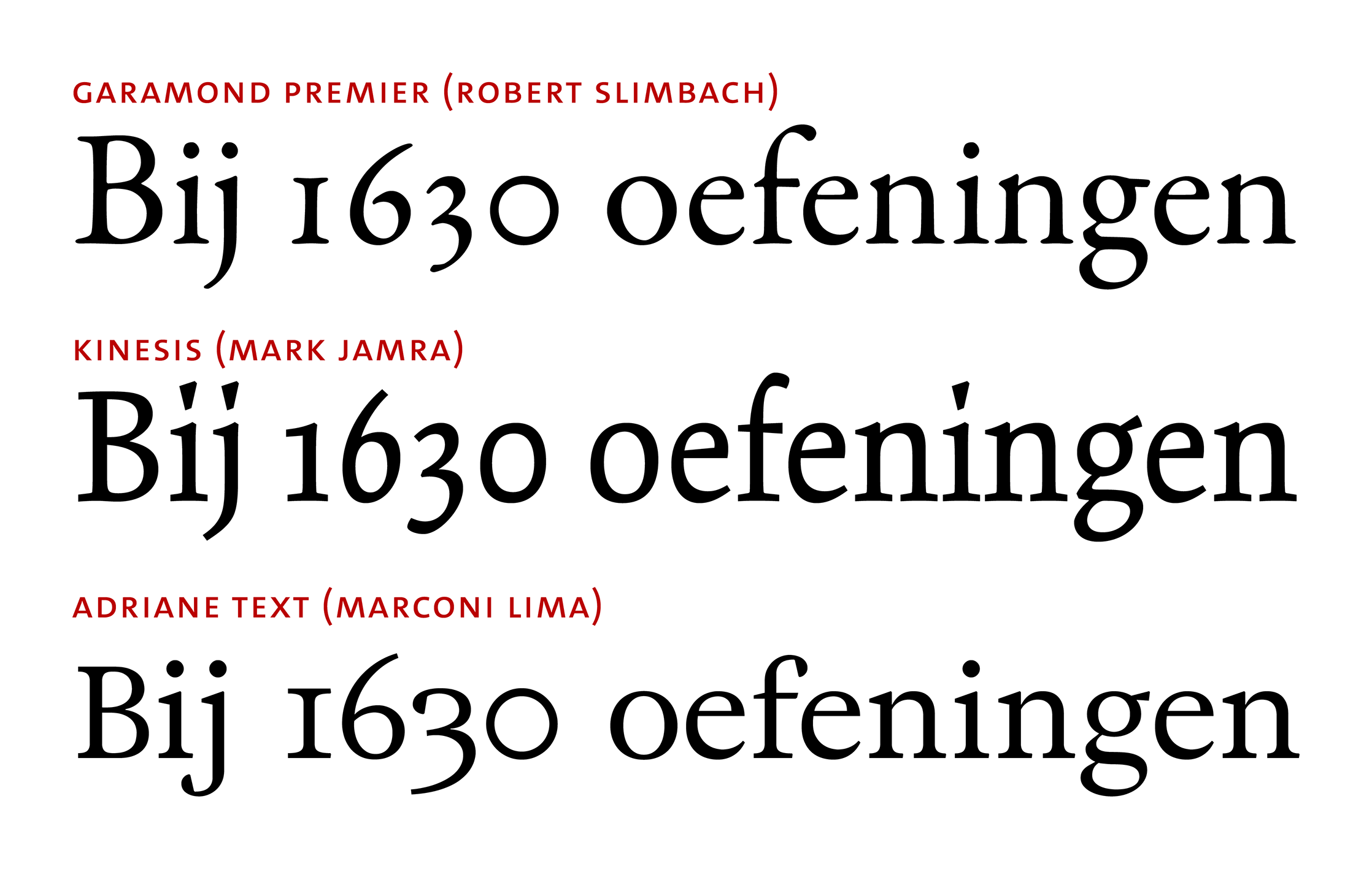
Apart from stress angle, contrast strength is another important aspect of the alternation between thick and thin sections of a letter. Stroke contrast has also been used to express differentiation between zero and oh. A traditional strategy, which has been in use for well over five centuries, consists in reducing the contrast in the zero glyph, sometimes to the point of (optical) disappearance. The stroke thickness of zero can be markedly thin (e.g., in Big Caslon, as Shiva Nallaperumal noted in his tweet), but usually it is somewhere between the thinnest and the thickest letter parts of the typeface. Garamond Premier is a typical example: Take the oh glyph, leave its width and height (almost) unchanged, iron out most of the contrast – and you’re done. The look of the final zero glyph depends on a number of factors: One of them is the overall contrast strength in the typeface. In Kinesis, it is less strong than in Garamond Premier in the first place, so further reducing it will be less conspicuous. Also, zero tends to look more peculiar when it is based on an oh glyph that is (almost) circular – as in Garamond – whereas the oh of Kinesis is far from circular. Sometimes a non-circular oh is made wider (and taller) to get a zero that looks like a perfect circle without stroke contrast, such as in Adriane Text the bottom row. Contrast increases in zero very rarely occur and are usually much more subtle than contrast reductions.
Other strategies
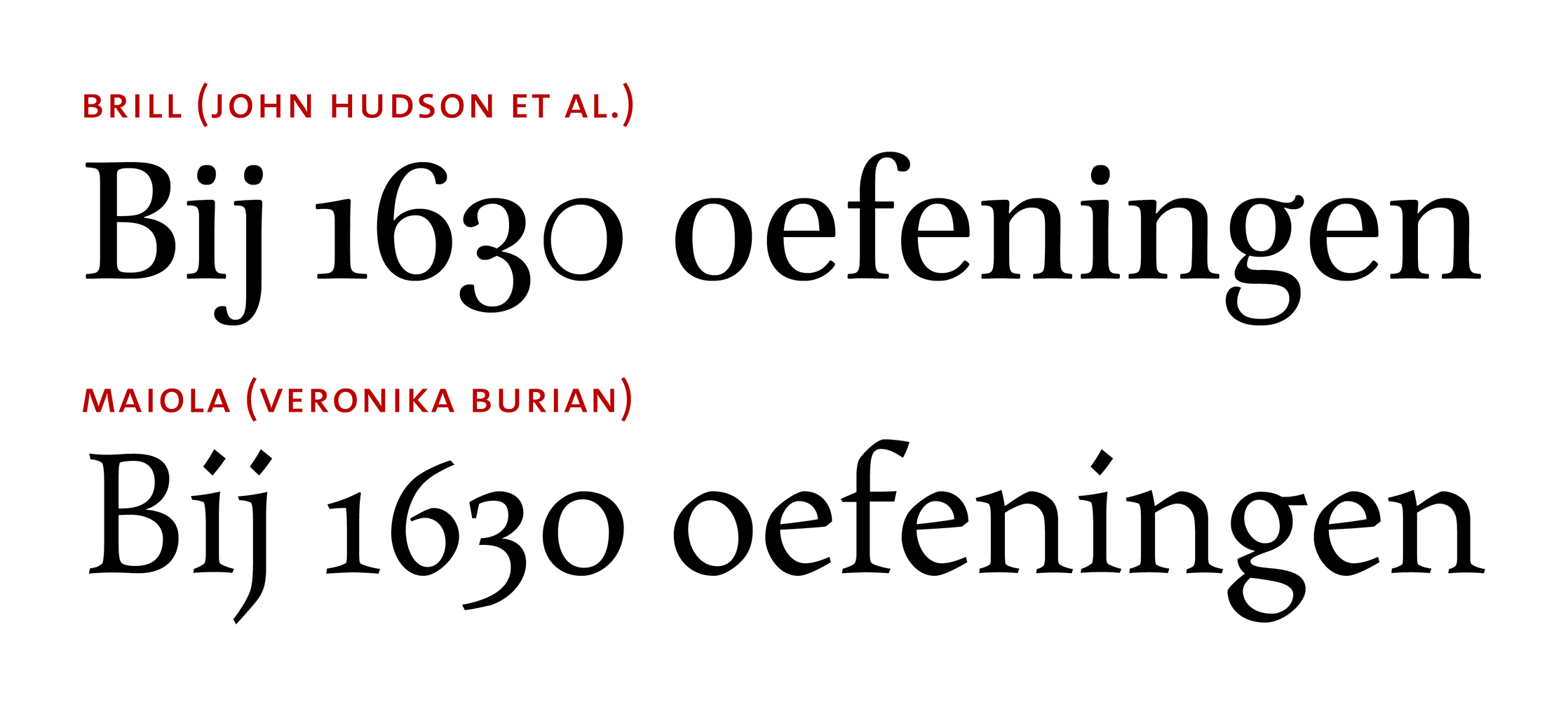
Rather than following these mainstream ways of keeping zero and oh apart, a few typefaces try another tack: An interesting example is Brill. Instead of fiddling with the stress angle or the size of the glyph, its designers adopted a different type of contrast. The typical distribution is replaced by uninterrupted thin and thick sections that blend into one another. There are only three other typefaces I know that take a similar approach, albeit with the thick section on the left-hand side: Whittingham (2000) by Günter Gerhard Lange and Dieter Hofrichter (thanks, Hrant Papazian!), Newzald (2008) by Kris Sowersby (thanks, Ben Mitchell!) and Questa (2013) by Martin Majoor and Jos Buivenga (thanks, Gerhard Großmann!). On Twitter, John Hudson explained that the reasoning behind placing the thick section on the right-hand side in Brill was led by the often final position of zero in numbers. It is difficult to say anything about the perception of this type of zero by naïve readers, but subjectively it is an option that I would not mind seeing more frequently. An even subtler differentiation was introduced in Maiola: Here, the difference between the two glyphs does not mainly lie in the shape of the counter (i.e., the white inside of the letter), but in the outside contour of the letter. The curve is more angular in oh, showing noticeable breaks at the top left and bottom right. Such breaks, characteristic of certain types of chirography, are noticeable in other letters as well, as “calligraphic reminiscences” (or so the promotional copy says). There are no breaks, however, in the zero glyph. The contour is smooth. That could be seen as a nod to the circular form zero has in many old-style typefaces (see above), while avoiding the full circle some dislike.
A bit of everything
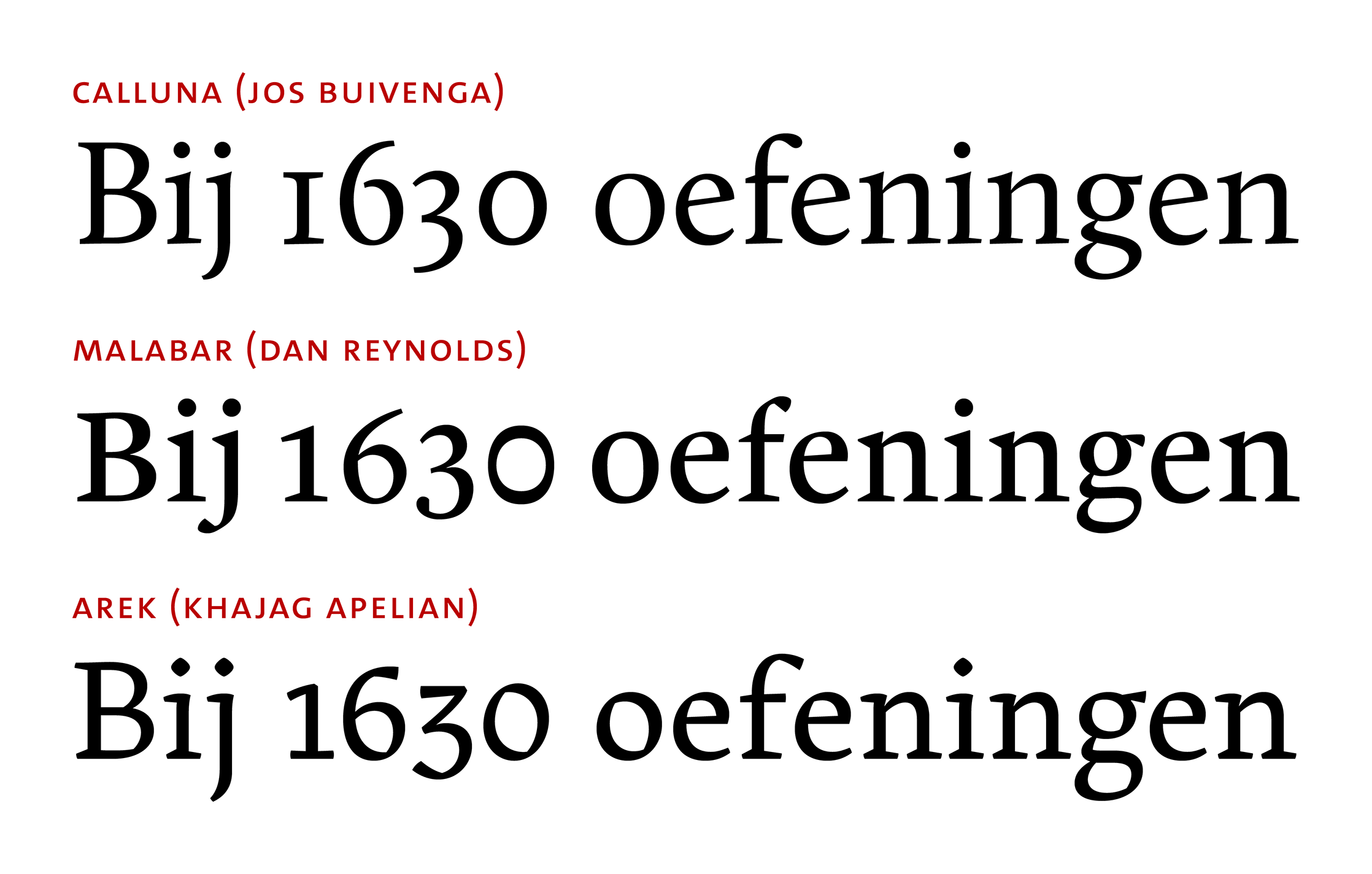
It is only now that I will admit that some examples I have shown are somewhat atypical. All are real, mind you. But I selected them specifically because most of them rely on one specific strategy to differentiate between zero and oh. A (small) majority of the typefaces in the Typekit sample, however, combines more than one of these strategies. Why only make zero wider when you can additionally reduce contrast? Why only slant its axis when you can also make it taller? Below are three examples of typefaces that – well, not exactly pull out all the stops in order to differentiate between these two characters, but that do use several strategies. The top row shows the most subtle differentiation: In Calluna, zero is both taller and slightly narrower than oh; its contrast has been reduced, but not eliminated. Compared to that, Malabar’s approach is rather in-your-face: The axis of contrast has been rotated towards the horizontal, the contrast has been reduced quite a bit and the glyph is taller. Arek falls somewhere between these two extremes: In terms of width and contrast strength, there is not much going on. But zero is a lot taller than oh and its stress angle is steeper (i.e., more towards the vertical).
The wide variance of (combinations of) strategies that type designers have employed emphasises the fact that there is no one-size-fits-all approach to differentiating zero and oh. Neither strategy is the only true one and neither is completely off the mark. While all typefaces shown here are serif typefaces that could be classified as Antiqua (or old-style), styles across the sample vary wildly. A broader and more systematic investigation would not be wasted on this topic: The roots of non-lining zero in medieval handwriting have already been sketched out by Bigelow (2013), but he only discusses three contemporary typefaces, all of which are revivals of renaissance type. The present overview, by contrast, focuses on very recent designs (with few exceptions). This leaves a wide gap of typefaces that have not yet been discussed with respect to the differentiation of non-lining zero and lower-case oh. Also, sans-serif, slab-serif and other typefaces have not even been touched upon. Let’s try to fill this void.
Don’t know what the earliest major font to use reverse-contrast on zero came from, but Stempel Garamond has it. I find it quite ugly myself.
Thanks for your comment! In his 2013 article, Charles Bigelow puts forward the assumption that a zero glyph with reverse contrast, as it was used in Sabon (1967), “may be an invention by Tschichold, not Garamond”. Current digital versions of Stempel Garamond indeed also feature a zero with reverse contrast (shown below). Unfortunately I don’t have access to a specimen of Stempel Garamond that predates the release of Sabon, but if a reverse-contrast zero was indeed used in early versions of Stempel Garamond (initial release: 1924), this would prove Bigelow’s conjecture wrong. Maybe someone else can shed light on this.
In a specimen from the late 1930s, Stempel Garamond is indeed shown with reverse-contrast zeros, both for oldstyle and lining styles. The sample of Garamond Peignot (1912–1928 according to Jaspert, Berry & Johnson) shown in The Encyclopedia of Type Faces (4th edition) suggests that this revival (“based on the original types in the Imprimerie Nationale”) featured such an – oldstyle – zero, too. This, however, is not necessarily confirmed by the sample shown on the site of the “Musée de l’imprimerie de Lyon”.
The zero in Ehmcke-Mediaeval (D. Stempel AG, 1922) has diagonal contrast, with the axis rotated by 90°. Ehmcke-Rustika’s zero (D. Stempel AG, 1914) has reversed contrast on a vertical axis — but this typeface exhibits all kinds of unusual contrast details. The earliest example I’ve come across so far is Feder-Grotesk halbfett (Ludwig & Mayer, 1910), shown below. While the regular weight (1909) has a conventional zero, the Bold shows considerable reversed contrast. This inconsistency suggests that the reversed contrast here is a side effect resulting from the narrower width of ‘0’ – unlike in ‘O’, there’s simply no space for the required mass to the sides.
I can very well imagine that there are examples (much) older than this. In any case, it’s not an invention by Jan Tschichold.
Great research. Thanks so much for looking this up! I notice that the open-source Federo revival of Feder Grotesk doesn’t include this style of ‚0‘.